Quick summary
Step into the future with ‘Website Design Trends That’ll Wow in 2024.’ We’ll explore cool things happening on websites, like colourful blends, handmade touches, trust-building proofs, super simple styles, and really awesome pictures.
These trends are making eCommerce websites look and feel amazing. Let’s check out what’s coming up in the world of websites in 2024!
Importance of website design
Your website is like the front door to your online home. The way it looks and feels is super important because it shapes how people see and connect with your brand. Let’s dig into why eCommerce website design matters so much!
Guess what? Making your website look good can make people stick around 84% longer and boost your revenue by 132%!
1. User experience enhancement
- Easy navigation: A good website is easy for visitors to find what they want. That means people stick around longer and check out more stuff.
- Mobile-friendly design: Since lots of people use phones to browse, a website needs to look good on a small screen. When it does, it’s easy to use, no matter the device.
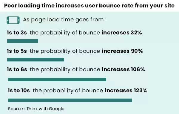
- Quick loading: Waiting is no fun, especially online. Fast-loading pages keep visitors happy, and it helps the website show up better in searches.
This is what happens when your website takes forever to load.
2. Brand representation and Consistency
- Cool logos and colours: Every brand has a cool logo and colours, right? They’re like the brand’s signature. Using them all the time helps people remember and like the brand more.
- Same look everywhere: Imagine if a brand looked different on your computer than on your phone – kind of confusing, right? Keeping the same look everywhere makes people trust the brand more.
Here’s the real talk: Nearly half of people, 46%, decide if a website is trustworthy just by how it looks. Brands like Apple, Zara, and Nike nail it with their cool and easy-to-use designs, making customers go ‘wow’ right from the start.
3. Conversion rates and business goals
- Buttons that work: Ever seen those call-to-action buttons that make you want to click? That’s what we’re talking about. When you put them in the right places, more people do what you want them to do.
- Trust and good looks: A website that looks pro and trustworthy makes people feel good about it. When people trust the site, they stick around and keep coming back. It’s like making new friends online!
According to Dynamic Yield, desktops might score more sales, but don’t sleep on mobile! Around 65% of folks use their phones to check things out, while desktops hang around at 32%.
4. Search Engine Optimization (SEO)
The way a website looks and works affects how Google shows it in searches. When the design is top-notch and works well on phones, it helps the website show up more in searches. It’s like turning on the spotlight online!
Related read: SEO trends to look out for in 2024
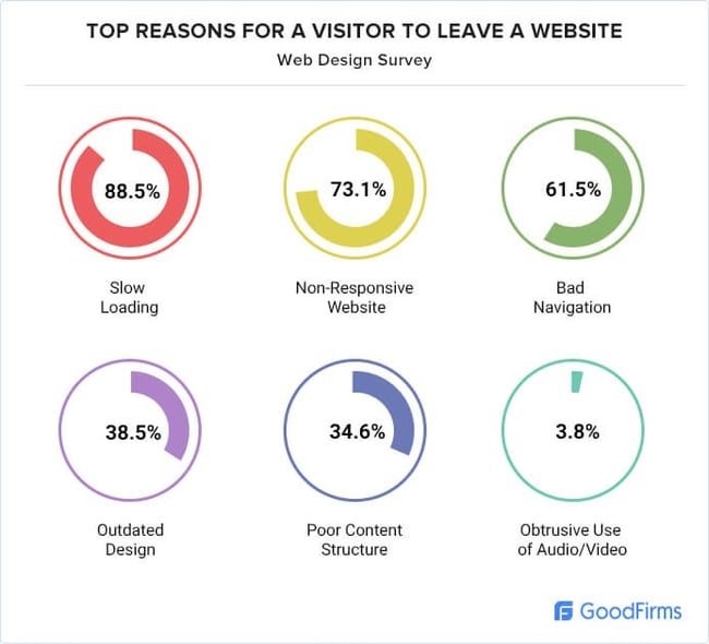
Let’s talk about why many visitors bounce off websites without doing anything. Take a peek at this image to get the lowdown.
Ever-evolving nature of web design trends
Web design is like a style that’s always on the move. It’s not just about looks; it’s a big deal for businesses and creators. Let’s chat about why web design keeps changing and what it means for things on the internet!
1. Technological advancements
- Continuous innovation: Tech keeps changing, and that’s huge for web design. Designers try out new tools, giving websites a fresh look and smarter functions.
- Cross-device compatibility: We use all sorts of gadgets these days, right? Phones, smart TVs, you name it. Websites have to work smoothly on everything. Designers are getting clever to make sure no matter what gadget you’re using, the website looks and works awesome!
2. User behaviour and expectations
- Changing user preferences: Designers love making websites easy for everyone. They check how people use the internet and tweak things to make things more intuitive for customers.
- Visual storytelling: Websites are going more visual – thanks to social media and platforms. Designers use pictures to tell stories and make things exciting. It’s like they’re chatting with us using visuals in a fun and emotional way!
3. Cultural and aesthetic influences
- Cultural shifts: Websites mirror what’s happening globally. Designers pick up on trends and make websites trendy for everyone.
- Aesthetic preferences: People like different looks, so websites change styles to stay updated. Design trends switch up a lot, showing off all kinds of awesome looks from around the world.
4. SEO and algorithmic changes
Websites need to stay savvy with how search engines operate. Designers know the tricks to stay visible and relevant. Also, search engines love websites that people find easy to use. Designers make sure websites are super easy, so they rank higher!
Excited to check out the trends that will pull in customers like magnets in 2024?
Take a peek at our infographic to see the latest visual website design trends. It’s like a cheat sheet to help you easily understand the perfect visual styles!
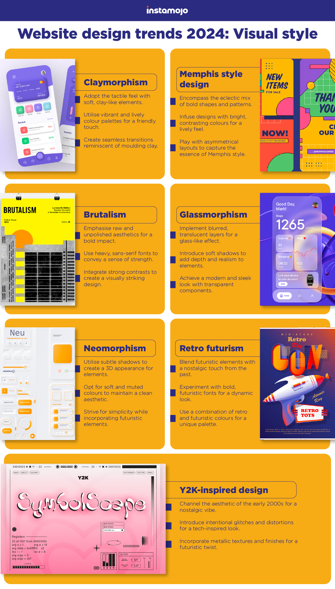
Want more simple options for our eCommerce website? Here are some easy to apply website designs for 2024!
Complex gradients: The art of colour blending
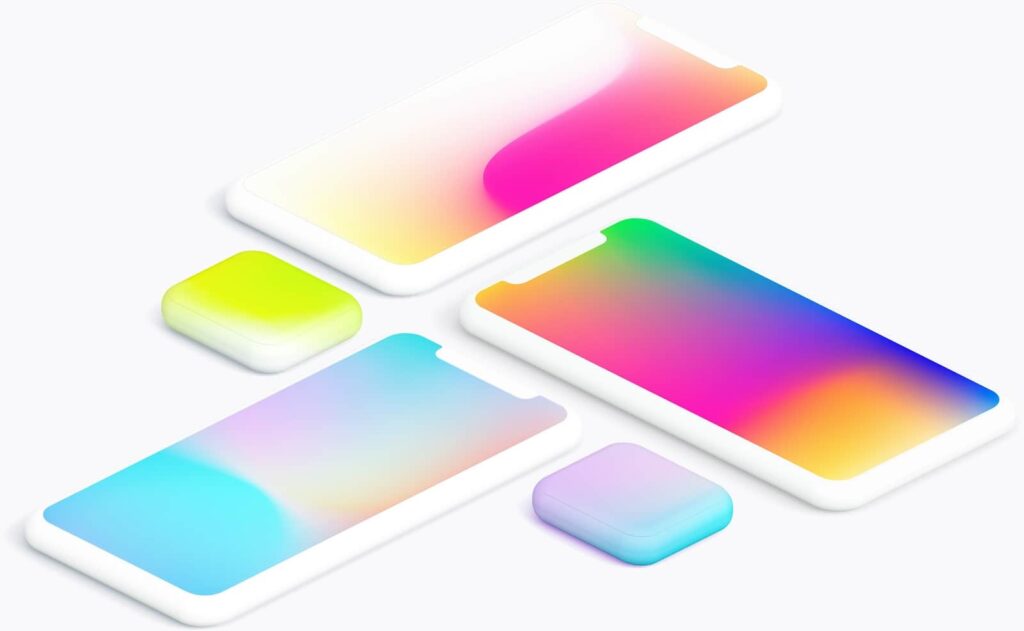
Colours on websites aren’t just pretty – they’re like magic! They can make you feel things and help you see what’s important. Now, designers are using super trendy colour blends called complex gradients.
A. What is it?
Complex gradients are like fancy colour blends on websites. Instead of regular smooth changes, they have lots of shades in one. It’s like adding layers of colours to make things look sharp and interesting. When you see it, it feels rich and kinda fancy, grabbing your attention!
B. Impact on user experience and aesthetics
Complex gradients make websites look fancy. The way colours blend is so eye-catching that it stays in your mind. And guess what? It’s proven that certain colours can evoke certain emotions. So use this to your advantage.
Related read: A guide on using colour psychology for your online store
C. Tips for implementing complex gradients effectively
- Match colours with your brand to keep things familiar and strong.
- If you’ve got lots of words on your site, make sure the colours don’t make them hard to read. Find the right balance between looking good and being easy to use.
- Check if those colours still look awesome on all devices – phones too! That way, everyone enjoys your site!
Want to host your own eCommerce website? Start with Instamojo for free!
Handmade graphics: Personalized touch in a digital world
On the internet, where everything is super precise and automatic, people are starting to use handmade graphics. It’s like adding a personal touch to the digital world.
A. The essence of handmade graphics
- Handmade graphics are like adding a crafty, handcrafted vibe to digital stuff. In a world where everything’s perfectly precise, these imperfect handmade things catch your eye.
- Each handmade graphic is one-of-a-kind, showing the personal touch of the creator. It’s like having something unique that stands out sharply.
B. Benefits of handmade graphics
- Handmade graphics make the internet feel more friendly and personal. They add warmth and personality, making users feel more connected to what they see online.
- These graphics often have a story – like a sketch or a hand-drawn letter. It makes the online experience more interesting and unforgettable.
C. Tools and techniques for creating handmade graphics
- Designers use awesome digital art tools like Adobe Illustrator or Procreate to make handmade graphics online. It’s like blending traditional and digital art.
- With graphic tablets and styluses, designers can draw right on a digital screen, making it feel like traditional art. This helps create precise and neat handmade graphics.
Build with Instamojo
Use the Instamojo ‘Builder’ Feature to insert handmade graphics on your website homepage!
With Builder, you can easily change how your header, hero banners, and testimonials look! You can also insert code snippets for interactive elements like pop-up banners, YouTube videos, your social media page and more.
Check out everything you can do with ‘Builder’ here!
Social proof as part of your website design
Social proof is like when people check out what others are doing before making decisions. Online, it means users want the thumbs-up from their buddies. Social proof comes in different forms – it can be happy customer stories, reviews, dope influencers saying it’s good, or even numbers showing how popular something is.
A. The impact on user trust and confidence
- Social proof is like a big thumbs-up, saying, ‘Hey, others liked this, you might too!’ It makes people feel sure about trying something.
- It’s also like showing off good reviews or stories from people who’ve already tried it. It helps people feel less worried about trying something new because they see others had a good time with it.
B. Integrating social proof seamlessly into website design
- Designers put social proof in significant spots on an eCommerce website, like fresh testimonials on the main page or ratings next to products.
- They make social proof look good and match the website style. It’s like making sure it adds to the trendy vibe, not takes away from it.
C. Best practices for leveraging social proof
- Real people saying real things – that’s the real deal in social proof. It’s way better than generic endorsements.
- Get shout-outs from all sorts of people – customers, pros, influencers, and even the team. It makes the story more legitimate and trustworthy.
- Keep it fresh! Swap out old comments with new ones so it stays up-to-date and still packs a punch.
Ultra minimalism: Less is more in 2024
In web design, there’s a groovy trend called ultra minimalism. It’s like the ‘less is more’ vibe but taken to a whole new level in 2024.
Designers are all about keeping things super simple – clean lines, tidy layouts, and focusing on what really matters. How? Let’s find out!
A. Essence of ultra minimalism
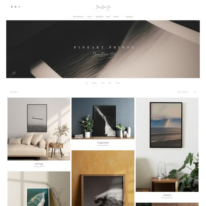
- Ultra minimalism is like minimalism on steroids – super simple, cutting out all the extras to keep things clear and clean.
- They use empty space on purpose to make things feel light and give important stuff room to shine.
Related read: How to optimise your online store homepage
B. Practical tips for achieving ultra minimalism without sacrificing functionality
- Keep things neat with a grid layout – it’s like a road map for users to easily find their way around.
- Stick to a few colours to keep it simple and let essential stuff pop. It’s like using a highlighter in a sea of black and white.
- Use the same clean font everywhere – it’s like having a stylish signature for your design.
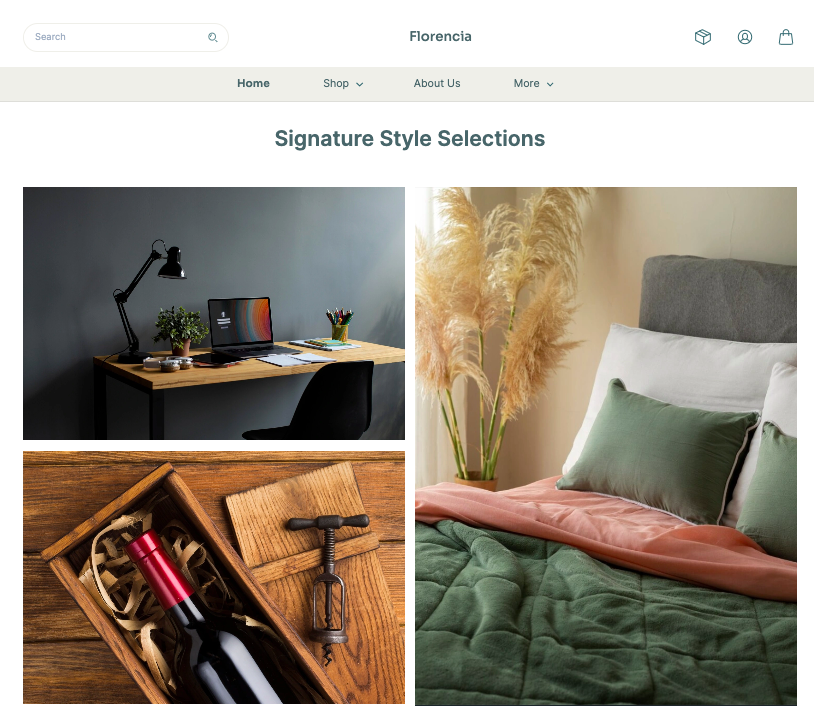
Check out the latest Instamojo theme – Florencia. This theme is perfect for eCommerce sellers who want a minimal vibe to their online store. You get lots of empty spaces interspersed with rich text and images. Product images get a fresh infusion of creativity with a variety of dimensions along with hover technology.
Emphasis on product photos: Visual storytelling at its best
There’s a saying: ‘a picture is worth a thousand words.’ And guess what? In 2024, businesses are all about putting a big focus on pictures of their products. It’s like telling a story without using words. Let’s see, how it will work!
A. The power of visuals in eCommerce and beyond
- You know what, online, your product pics are like saying ‘Hey, look at me!’ They grab attention and make people want to see more.
- These pics are not just about showing what the product is – they make you feel something. It’s like telling a mini story and making a connection that goes deeper than just features.
B. Techniques for showcasing product photos effectively
- Get pros to take super clear and fancy pics – it makes your stuff look top-notch and professional.
- Let users play around with your products online – zoom in, and spin them around. It’s like bringing the store to their screens for a fun shopping experience.
- Show your products in real-life situations in the pics – it helps people imagine having them in their own lives. It’s like telling a story that everyone can relate to.
Related read: eCommerce product photography: 7 cost-effective hacks + examples
C. Tools and technologies enhancing the visualization of product photos
- Try stuff on virtually using AR tech – it’s like a magic mirror for clothes, accessories, or furniture. You can see how things look in your own space before deciding.
- Fix up your product pics like a pro with fancy editing tools. They help make everything look perfect, from colours to removing backgrounds.
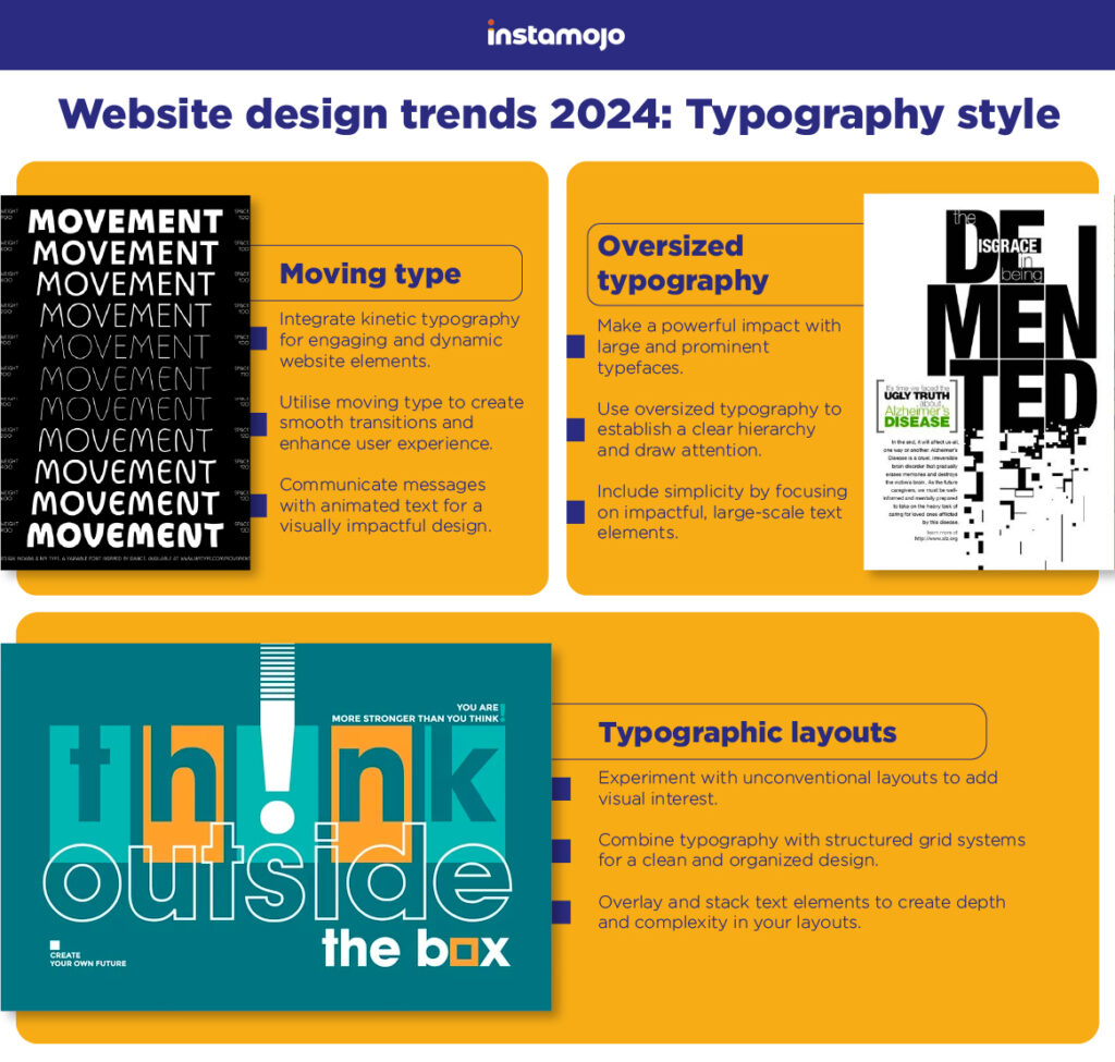
Guess what? We’ve got another visual guide – an infographic that spills the beans on the typography styles in the website trends for 2024. Check it out and stay in the design loop!
Elevating web design standards with Instamojo
Instamojo is giving eCommerce websites an awesome makeover! It’s not just about creating websites; but making them look awesome and work super smoothly. Imagine a website that’s not just pretty, but also easy to use – that’s what Instamojo is all about.
We’re making sure your online space is as cool as your brand, so everyone loves hanging out there. Yes, we’ve cracked the code to making websites that are both stylish and friendly, so your online presence can be the talk of the town!
Get your own Instamojo account for free!

