Quick summary: Welcome to our blog all about eCommerce popups! Our main goal here is to equip you with the knowledge and strategies needed to make the most out of these nifty tools. We’ll show you how to leverage popups effectively to generate valuable leads and, most importantly, boost those sales figures. Whether you’re a seasoned online store owner or just starting in the eCommerce world, this blog will provide you with practical tips and real-life examples to help you implement popups like a pro.
Picture this: your online store is like a bustling marketplace, complete with digital shelves stacked with products that deserve the spotlight. But wait, there’s a twist.
Imagine having a virtual salesperson who steps forward just at the right moment, highlighting special deals, capturing emails for future engagement, or gently nudging hesitant shoppers toward completing their purchase.
This is exactly what a single popup could do. So what are popups in eCommerce, and how can you use them in the most efficient and non-intrusive way? Here are some practical tips for the practical entrepreneur.
What are eCommerce popups?
Have you ever visited an online store and a little box suddenly popped up, asking you to subscribe or offering a discount? Well, those little attention-grabbing boxes are what we call eCommerce popups!
If you’re running an online business, eCommerce popups can be your secret weapon for success.

These tiny windows are not just annoying distractions; they play a vital role in capturing and retaining your visitor’s attention. If you were in a physical store, you would have a salesperson who could let you know about current offers. Popups help us achieve this in the online world.
As entrepreneurs, we know how crucial it is to stand out in the competitive online market. Popups can help you do just that by driving conversions, growing your email lists, and even reducing cart abandonment rates.
4 insane benefits of using eCommerce popups
1. Capturing and retaining visitor attention
When a potential customer lands on your online store but they seem a bit undecided? That’s where eCommerce popups can swoop in to save the day!
These attention-grabbing little boxes can instantly captivate your visitors’ attention, offering them exciting deals, product updates, or exclusive content.
By using eye-catching visuals and compelling headlines, you’ll keep your visitors hooked and interested in exploring what your online store has to offer.
2. Driving conversions and sales
What if I told you that eCommerce popups could be your ultimate sales booster?
When strategically placed and well-timed, popups have the magical ability to turn curious visitors into loyal customers.
Offering limited-time discounts or enticing upsell opportunities through popups can nudge potential buyers into making that final purchase. It is important to have an effective CTA and a copy that creates a sense of FOMO in the customer.
Related read: 9 eCommerce Call to Action examples that see crazy conversions
3. Growing email Lists and building customer databases
As an entrepreneur, your email list is like a goldmine of potential customers. eCommerce popups can be your key to unlocking that treasure trove! Popups are lead magnets that encourage “leads” to drop in their information voluntarily. Leads = Potential customers.
Building a strong email database means you’ll have a direct channel to communicate with your audience, share updates, and promote your products or services effectively.
Offering an ebook in exchange for subscribing to your newsletter has a success rate of 7.49% compared to a simple newsletter CTA that has a success rate of 5.10%. – Optimonk
For example, our popup encourages people to subscribe to a fortnightly newsletter that will help D2C entrepreneurs with insider insights, expert tips and business growth strategies. And in return we offer a free ebook. This simple strategy has helped our newsletter grow upto 2 lakh subscribers.
4. Reducing cart abandonment rates
Cart abandonment can be a real headache for online store owners. Exit-intent popups are designed to appear just when your visitors are about to leave the website.
Cleverly crafted exit popups can offer tempting discounts or remind users of their abandoned carts, giving them that extra nudge to complete the purchase.
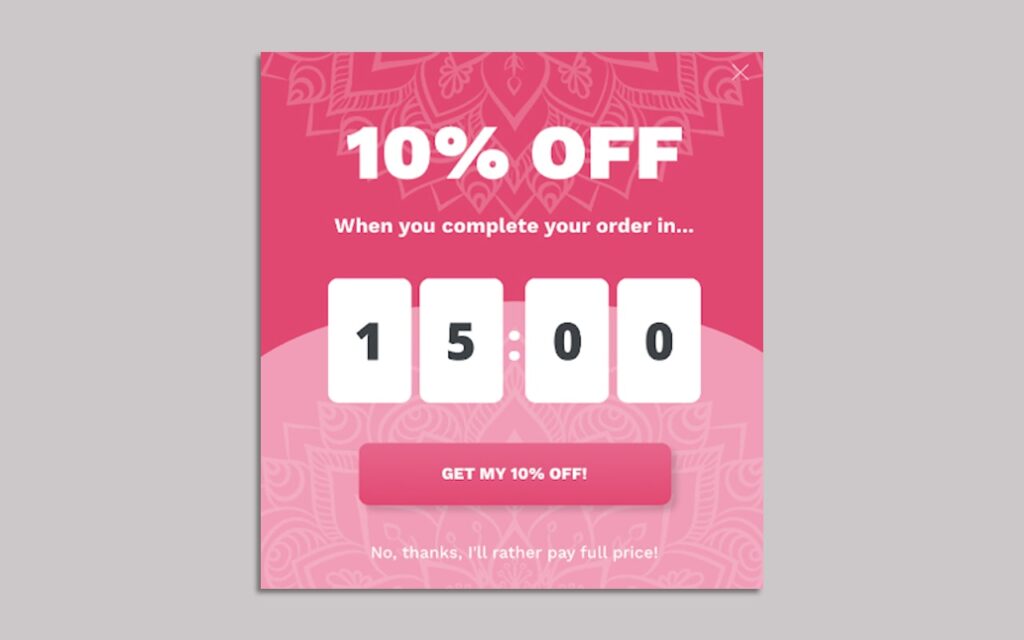
You’ll be amazed at how much you can reduce cart abandonment rates and recover those lost sales with this simple yet powerful tactic.
Types of popups that you can have on your website
1. Entry popups
Entry popups appear immediately after a visitor lands on a website. Their value lies in capturing the visitor’s attention right from the start. These are a good way to offer ‘welcome’ discounts to customers.
But they should be used carefully to avoid being an immediate turn-off. They can be attention-grabbing, but they can also be seen as intrusive by some users.
2. Exit-intent popups
Exit-intent popups are triggered when a user is about to leave the website. These popups can present last-minute offers, discounts, or compelling CTAs to encourage the visitor to stay or complete a desired action. Their value lies in recovering potentially lost conversions.
3. Timed popups
Timed popups appear after a specific amount of time has passed since the visitor landed on your eCommerce website. They can be used to showcase special offers, collect leads, or promote specific content.
Their value lies in engaging visitors who have spent a certain amount of time on the website, showing that they might be interested in what you have to offer.
4. Scroll-triggered popups
Scroll-triggered popups are activated when a user scrolls down a certain percentage of the landing page.
They are useful for providing additional information or offers related to the content the user is reading. Their value lies in offering relevant content and promotions as users interact with the website.
5. Click-through popups
Click-through popups are displayed when a user clicks on a specific element, button, or link on the website.
They can be used to offer more details, collect feedback, or present opt-in forms. Their value lies in providing users with additional information or options based on their specific interests.
6. Gamified popups
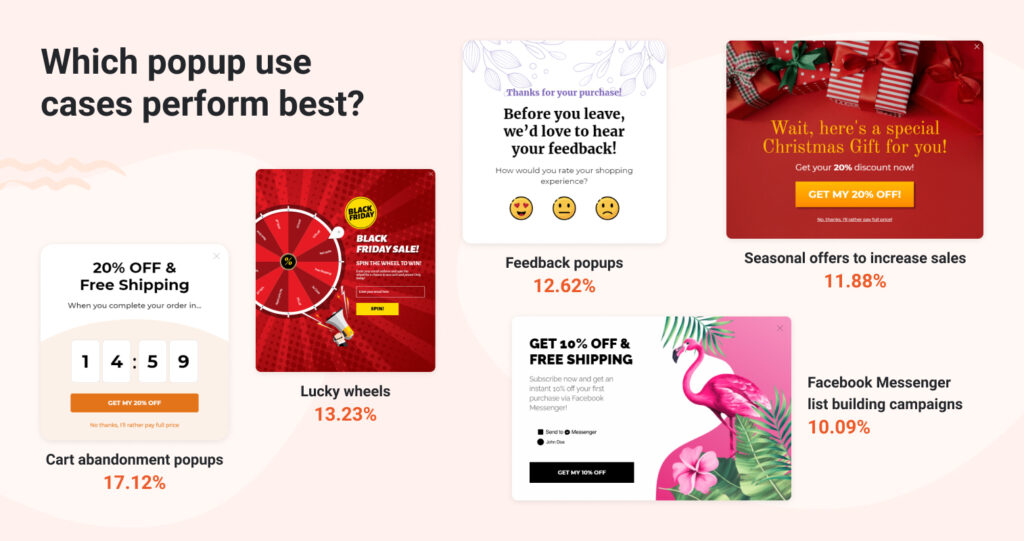
Just because its business doesn’t mean you cant have fun? Gamified popups like spinning wheels, lucky draws etc. add an element of fun on your online store. These are also the best kind of popups to encourage engagement from online visitors.
Here is a snapshot by Optimonk to show you the different conversion rates for different use cases:
5 Examples of attention-grabbing popups for D2C brands
1. Using entry popups by Nassan
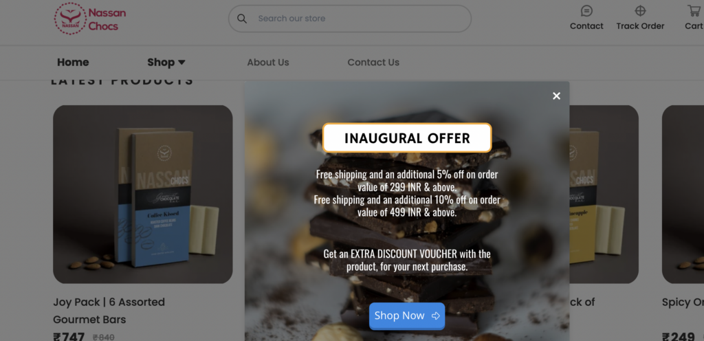
Nassan.in, an artisan homemade chocolate brand uses an entry popup to offer an “inaugural offer” to encourage first-time visitors to make their purchases.
2. Lead magnet used by Noorali
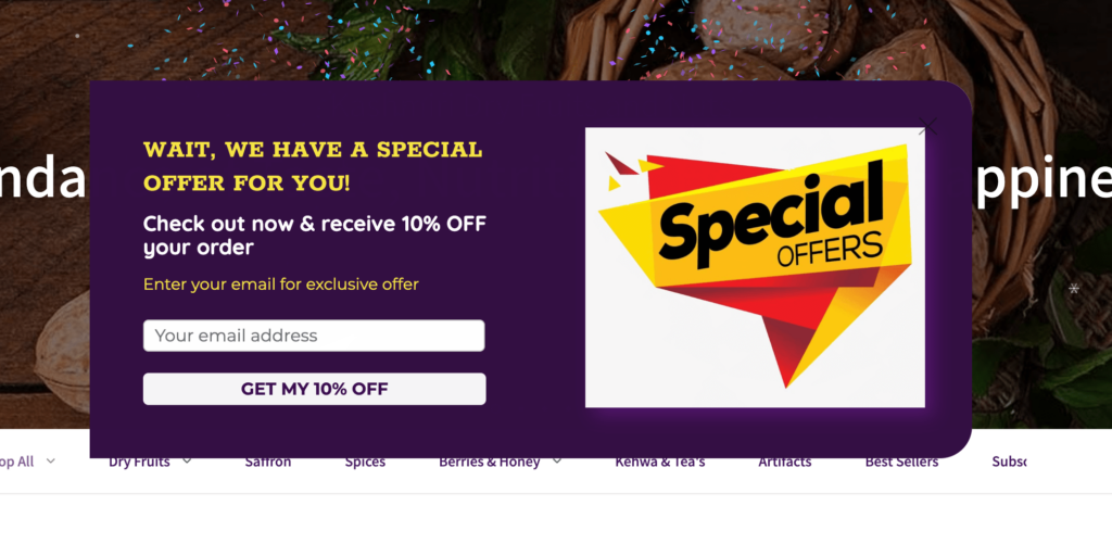
This online store on Instamojo uses timed popups to offer discounts to customers and also collects their email IDs in this process. This helps build the lead base of Noorali and they can communicate other offers and product launches easily through email.
3. Free trial promotions by Hootsuite
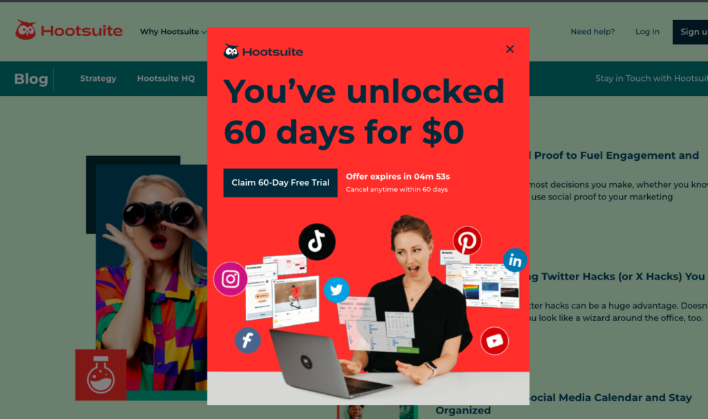
See how Hootsuite is using this bright and vibrant popup to let visitors know about their special trial period offer for new customers. This simple yet effective CTA will encourage people to sign up to Hootsuite for the extended trial period.
4. Offers by Mama Earth
A simple popup yet effective to let customers know current discounts that are currently running on this website.
These kinds of popups are non intrusive. They are clearly marked and in contrast with the rest of the theme. So it does catch you eye, but it does not harm the entire shopping experience.

5. Promoting a giveaway on Instamojo
This is the polar opposite of the Mama Earth example. If Mama earth’s popups were designed to be non-intrusive and subtle, we at Instamojo wants our audience to clearly know that a massive event is taking place.
The nature of the giveaway (For example: its huge offer value, its duration) makes this a good way to ensure that maximum visitors see it and interact with. This popup takes up your entire screen, and can be removed when a visitor deliberately clicks on the ‘X’ sign.
These can be powerful to encourage a visitor to perform an action, but should be used wisely and for limited reasons.

Best practices when choosing popups for your online store
1. Balance user experience with popup effectiveness
While popups can be powerful for lead generation and sales, it’s crucial to strike the right balance between their effectiveness and providing a positive user experience.
Avoid intrusive and frequent popups that disrupt the user’s browsing flow. Instead, use subtle and well-timed popups that offer value to the user. Consider using exit-intent popups or scroll-triggered popups to engage visitors only when they show intent or interest.
Once you prioritise user experience, you can then utilise popups without worrying too much about making a good first impression.
2. Don’t overwhelm visitors with too many eCommerce popups
Nobody likes feeling bombarded with popups while trying to browse a website. To prevent overwhelming your visitors, limit the number of popups you display on a single page.
Focus on delivering relevant and valuable content through your popups rather than bombarding users with multiple offers simultaneously.
Timing is everything, so avoid showing popups immediately upon page load or too frequently during a single session.
Related read: Offering festival discounts? Here’s how to do it right
3. Some best practices for displaying popups on your eCommerce website
To ensure your popups are effective and well-received, follow these best practices for displaying them on your website:
1. Strategic placement
Choose the right positions for your popups, such as the centre, side, or bottom of the screen, based on the content and purpose of the popup.
Avoid covering essential information or CTA buttons.
2. Mobile responsiveness
Make sure your popups are mobile-friendly and don’t interfere with the user experience on smaller screens. Consider using smaller, unobtrusive popups for mobile users.
3. Clear CTAs
Ensure your popup has a clear and compelling call-to-action that tells users what action you want them to take. Avoid vague or confusing CTAs that might lead to frustration.
Here are some other best practices specifically related to effective call-to-actions with examples.
4. A/B Testing
Test different popup designs, copy, and timings to see what works best for your audience.
A/B testing can help optimize your popups for maximum engagement and conversion rates.
Related read: A/B testing your landing pages; The right way!
5. Frequency Control
Set rules to control how often a popup appears to the same user, such as limiting it to once per session or per visit.
This prevents irritation caused by repeated popups.
6. Exit Option
Always provide an easy-to-see option for users to close the popup if they’re not interested. Respect their choice and don’t force them into actions they don’t want to take.
Tools and platforms for the best eCommerce popups
If you’re ready to take your eCommerce game to the next level with popups, you’ll need the right tools in your arsenal.
Luckily, there’s a plethora of popup tools and plugins available for different platforms that can make your life a whole lot easier.
For WordPress users, options like OptinMonster and Poptin are crowd favourites, offering easy integration and powerful customization.
If you’re running an online store on Instamojo, elfinston, hello bar poptin are excellent for providing seamless popup creation and targeting options.
Important features to look for when choosing a popup platform
With so many popup solutions out there, it’s essential to know what to look for to find the perfect fit for your eCommerce needs. Here are a few things you should keep in mind:
- Flexibility is crucial. Make sure the popup tool allows you to create different types of popups, like exit-intent, timed, and scroll-triggered.
- A must-have feature is customizability. This enables you to match the popups seamlessly with your brand’s look and feel.
- Advanced targeting options are a game-changer, ensuring you reach the right audience with the right message at the right time.
- Let’s not forget about analytics! The best popup solutions will provide valuable insights into popup performance, conversion rates, and user behaviour, empowering you to fine-tune your strategies for maximum impact.
Now that you know how effective popups can be and the best practices for placing popups on your online store, all you need to do is get started with a good popup solutions platform.
Give your entrepreneurial ideas a whirl with Instamojo, India’s simplest online selling platform. Host your own eCommerce business on Instamojo and get access to a suite of tools that will help you grow, run and manage your operations.
The best part? You can sign up for absolutely ZERO cost.

