Your Instamojo online store homepage is the digital face of your business, and getting it right can make a world of difference. It’s the first thing your customers see, and it can either captivate or deter them.
So, if you’re looking to enhance your eCommerce presence and boost your online sales, you’re in the right place.
In this guide, we’ll walk you through the essential steps to optimise your Instamojo online store’s homepage, ensuring that it not only looks great but also functions seamlessly to attract visitors and drive conversions.
Let’s dive in and make your online store shine!
5 tips to optimise your Instamojo online store’s homepage
Your Instamojo online store’s homepage is like your shop window in the digital world. It’s what people see first, and it can make a big difference in getting them interested and buying from you.
So, here comes 5 easy tips to make your Instamojo online store’s homepage better. These tips will help you make your page look great, work well, and bring in more customers.
1. Featured products
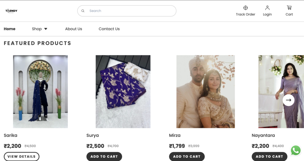
So, when you’re setting up your online store with Instamojo, you’ve got to pay attention to the ‘Featured Products’ section.
It’s a pretty nifty feature that comes by default, and it’s there for both the basic and premium plans.
What’s cool about this is that it lets you showcase your best-sellers or new stuff you’ve got in store. This way, your visitors get a quick peek at what you’re all about without having to dig through tons of pages.
Check out Trendy Naari’s homepage (Instamojo online store) to see an example of how this ‘Featured Products’ section can make your store look sleek and user-friendly:

2. Proper navigation
When you’re putting together your website’s main page, one thing you’ve got to nail is the navigation.
Consider it as the map to the rest of your website – the product pages, ‘about us,’ shipping info, FAQs, and more.
The idea here is to make it super easy for your visitors to find what they want without clicking all over the place.
Your homepage is like the boss of your website. In website lingo, it’s like the captain passing on power (we call it “link juice” or “authority”) to other pages.
So, if your homepage is good at this job, it helps with your site’s ranking on search engines. You see, your homepage is like the heart of your website, connecting all the important parts together.
And the cool thing is, when you use Instamojo for your online store, this navigation stuff is done automatically!
Every website is a bit different, but here are some navigation ideas that work for online stores:
Logo: Always be sure the logo links to the homepage.
About Us: Write your about us with brand story and make sure it’s linked to your homepage
Contact: Keep your contacts page accessible from your homepage or footer
Checkout/Cart: You want visitors to be able to get to their cart and check out easily.
3. Optimise for search engines
The next crucial step is to optimise your homepage for search engines. This means that you need to make sure that Google understands what your online store sells when it crawls it, and thus ranks it for relevant searches.
There are three main elements you should consider when optimising your homepage for SEO — metadata, content, and site security.
Metadata
Now, let’s talk about some important stuff to help your website show up in search engines. It’s like telling them what your website is all about, and this info pops up in search results.
First, you’ve got something called “meta titles.” These should be about 60 characters long. It’s good to have your brand name, what you do, and where you are if you have a physical store.
Then, there’s the “meta description.” Keep this one short, around 160 characters. In here, you want to mention the main things you sell and what makes your store special.
You can enter all this meta stuff from the back end of your website. If you’re using Instamojo, you’ll find a special spot on the dashboard just for SEO. It’s where you can make your store more search-friendly.
Here’s a detailed guide on writing metadata.
You can get the advantage of:
- Boosting your visibility in search results with basic SEO.
- Attracting the right visitors with Custom Metatags.
- Connecting your store to Google Search Console through Google Webmaster.

This feature is absolutely available for the free and paid versions but could get best results with the premium account.
Homepage content
If you’re not adding content to your homepage, you’re missing out on getting your site crawled properly. Once you know the keywords you need to rank for, you can easily create content for your homepage.
Your homepage (and other pages of your eCommerce website) should have one h1 tag, ideally containing keywords you’re targetting.
Also add text content wherever possible. You can describe your product experience or give an overview of your brand. This is a great way to incorporate your keywords.
For more insights, read our blog on eCommerce SEO.
Site security
An eCommerce website should have a secure site certification on the server. Commonly called SSL, it ensures that information transmitted within your site (like contact details, and payment) is secured.
Having an SSL-certified website is good for SEO and also gains customer trust. The best place to add your SSL certificate or logo is the homepage footer
4. Make your homepage visually appealing
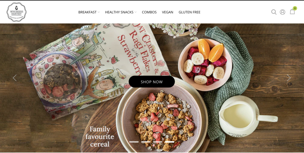
The theme you choose for your online store is more evident on your homepage than any other page. So, make sure you choose it wisely. You can also modify the font and colours of your homepage to suit your brand image.
Banner images are ‘above-the-fold’ elements and are the first thing that site visitors see. So make sure you get it right to capture their attention. Here’s how to do it right:
Use high-resolution images and make sure the file size is not too heavy
Avoid generic stock images
Use multiple images
Add alt texts describing what your image is about
Add a CTA button near the banner image

5. Extra elements
Now that you know the basic elements to have in your homepage, let’s look at some additional elements that will boost the functionality of your eCommerce website and overall user experience:
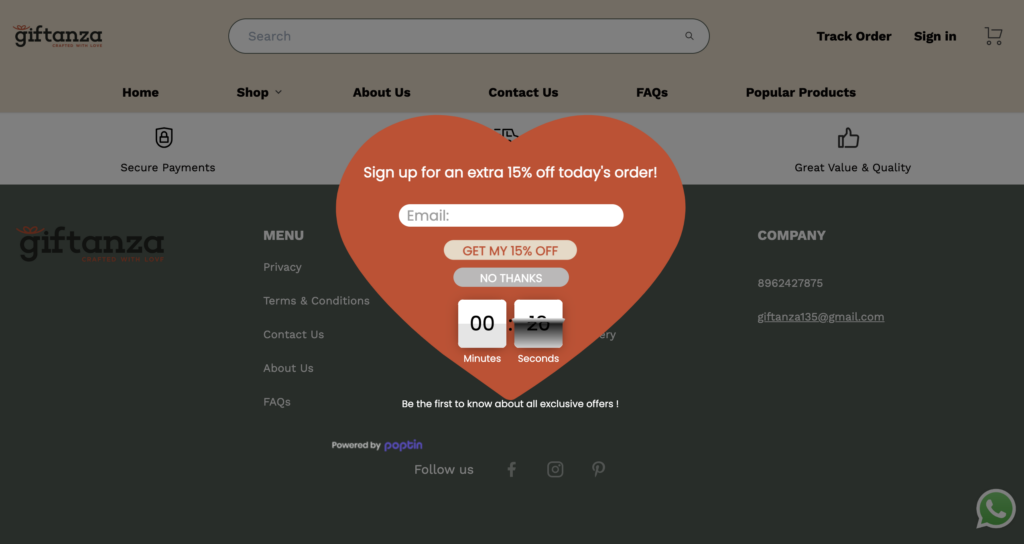
- Popups: Catch the attention of first-time visitors with popups showcasing a sale you’re running or a special discount for first orders. You can use a full-page popup or something more subtle like a banner popup.
You can get this feature with Instamojo’s premium account. For sure, it would be worth it. Try it yourself!

- FAQs: Adding a few FAQs with Instamojo at the bottom of your homepage would be helpful for new customers. It’s a great way to clear common queries customers may have.
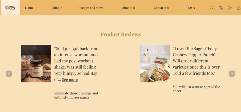
- Testimonials: Showcase what your customers have to say about you in your homepage with Store Testimonials available at Instamojo. You can add them while creating your online store.

- Chatbot: Give site visitors a virtual customer support experience with the help of a chatbot. You can easily embed this into your homepage and answer customer queries without hassle.
Tip: When choosing elements for your eCommerce website homepage, make sure that the page doesn’t get cluttered.
Make the most of your Instamojo online store homepage
Your homepage is all about first impressions — both to the visitor and search engines. It can be challenging to modify all aspects of your homepage. This would be much easier with an intuitive store builder like Instamojo.
With Instamojo, you can create an online store and customise it easily without any design and coding knowledge.
It comes with SEO features, attractive themes, and good store structure. You can also change the fonts and colours along with adding the chatbot widgets, popups, testimonials, and other elements.

