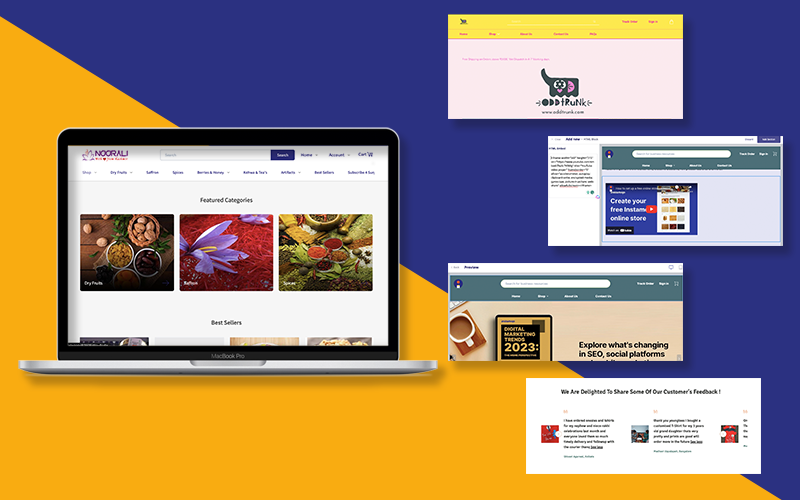
We at Instamojo are dedicated to building products that offer true value. Every product and its features are made keeping our end consumers in mind. When we acquired GetMeAShop, we had a goal – for small businesses to get a fair chance at selling their products without the fear of unfair competition or cut-throat commissions.
Since then, we have seen businesses and brands of all sizes hosting their own online stores on Instamojo, and it has been such a wild ride!
I am Monica Neelam, and I have been a Product Manager that has had a chance to work with an awesome team that shows an incredible ability to stay in tune with our customer’s thoughts and expectations.
We recently started working on something new. Something that we were sure was going to be a leap in the user experience of our merchants. Me and my dedicated team have been burning the midnight oil to bring you the Home Page Customization feature through our Builder Platform.
So, buckle up as I share our exciting ride – from identifying a crucial need, and overcoming hurdles, all the way to offering you some priceless tips to make the most of this game-changing tool.
Let’s dive in, shall we?
Recognizing the gap
Imagine stepping into a vibrant online world where everyone is setting up a shop. Amidst all this hustle, we spotted a gap.
As an online seller, you wanted to ensure your online store had a distinct touch. But the existing options were either too baffling to navigate or too restrictive to let your creativity flow.
This showed in simple concerns like “All Instamojo stores look similar”, “Why can I change my search button location” “I want to give my unique flair to the store” and “I don’t know coding, How can I make changes to the way my home page looks?”.
That’s when we knew we had a mission on our hands.
Introducing the home page customization tool
Our mission? To make your life easier and your online store your own piece of digital art.
Let me introduce you to the star of the show, the home Page customization feature – The Builder.
Imagine it as your magical toolbox, filled with all the right tools to create an online storefront that’s as unique as you are. Banners, testimonials, product showcases – it’s a playground for your creativity.
At its core, the Instamojo store ‘Builder’ Platform is your personal design studio where you shape your store’s homepage as your heart desires.
From rearranging sections to tweaking content, the possibilities are endless. Even if you are a coding pro, or you are taking your first steps in the online world – our platform is here to hold your hand and make customization a breeze.
Related read: How to optimise your online store’s home page
Behind the curtains: Our journey
Now, let me pull back the curtains and give you a sneak peek behind the scenes. Our team is a bunch of creative masterminds – designers who understand aesthetics, tech wizards who work magic, and testers who leave no stone unturned.
We brainstormed, collaborated, and meticulously turned your needs into reality. We wanted you to have the option to do whatever your heart wanted. If you had a vision in mind, we wanted to ensure you could bring it to reality.
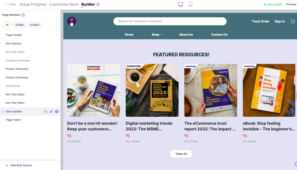
Solution 1: Breaking up the homepage into sections
Sections like testimonials, product catalogues etc. exist because we know it’s important for a well-functioning online store.
But, we want to give you the power to choose if you want to display them or not.
Along with these sections, each section comes with its own layout options!
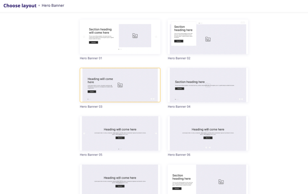
Solution 2: Understanding the degree of customisation that users would want
Along with important pre-defined sections, we also wanted to ensure you could insert elements at your own pace and interest with our Instamojo store ‘Builder.
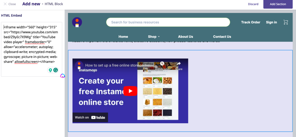
The rich text editor blocks and the HTML blocks allow you to insert whatever text, image, or custom scripts you want on your home page.
Want to embed a video? Done.
Want to use images to tell a story? Here you go.
Solution 3: Figuring out how to balance structural integrity with creative flair
We wanted to give you freedom, but also help you with our understanding of what it means to run an online business. As an eCommerce platform, it is our duty to ensure you have the tools that help you grow in your trade.
The Instamojo store ‘Builder’ has sections like ‘Testimonials’ that are imperative when building customer trust, it has a ‘Store update’ section that can help you collect leads, a ‘Footer’ that can help with store navigation and lets you provide information that will make it easy for the customer to connect to you.
Instamojo store ‘Builder’ bonus: See real-time changes
We understood the need to see with your own eyes what the changes were doing to your store. Hence, the real-time preview.
That was like putting a puzzle together, ensuring that your changes instantly came to life on both desktops and mobile screens.
Golden nuggets for mastering the art
Now, let’s talk about how to make this feature your secret weapon.
First things first, strategize. Jot down your vision before you start the actual tweaking. To keep things consistent and visually appealing, stick to a theme – the same colours, fonts, and vibe. Your brand is your identity.
And here’s a golden rule: your customers are the heroes of your story. So, place elements where they catch the eye first.
Oh, and remember the mobile squad – tap that mobile view button to ensure your store shines bright on smaller screens too.
Lastly, keep experimenting. Trust me, you won’t break anything!
Final words from the Instamojo team
This feature isn’t just a boon for individuals; it’s a game-changer for small and big businesses alike.
For small businesses, it’s a chance to shine like a diamond in a sea of rocks. You get to create an online presence that matches your brand’s personality. You don’t need to be a coding guru; our platform takes care of the tech stuff while you focus on your passion.
And for the big players, it’s about elevating your online space to reflect your grandeur. You can experiment, pivot, and roll out fresh designs swiftly. This feature is your ticket to keeping up with the ever-evolving online landscape without breaking a sweat.
Stay tuned for more greatness
This journey, from the inception of the idea to its development, took us around a year, spread across four quarters. We brainstormed, connected with our users, put pen to paper, designed, and finally brought it to life.
So, there you have it – the inside scoop of our quest to empower your online journey. We’re here to walk alongside you, every step of the way.
Get ready to make your online space an unforgettable masterpiece!

