We talk a lot about branding, standing out from the competition, building your unique identity etc. For an online store owner, all of these happen gradually. But the first step is always – To build a homepage that your customers fall in love with. <3
Introducing the most anticipated online store feature: Builder
Our latest product is designed to empower entrepreneurs, online sellers, handmade artists, and small to micro businesses to build a visually stunning and engaging online store with ease.
Introducing the Instamojo online store ‘Builder’
‘Builder’ allows users to completly customize and design the home page of your Instamojo store or website. You get access to various features and functionalities that let you modify the layout, sections, and content of your website’s home page.
Second. Your online store can easily be distinguished from all the other online stores that are hosted on the Instamojo platform.
Explore ‘Builder’
Here are some other significant benefits that you get by using ‘Builder’
1. Customize with confidence
Change and modify each section of your online store homepage to look exactly the way you want, reflecting the unique personality of your brand.
2. Layout choices
Choose from a diverse range of layouts for each section, allowing for a seamless design that aligns with your brand’s visual.
3. Tell your brand’s story with rich text editors
Insert images and texts to weave a captivating story about your brand, making it easy for customers to connect with you and your products.
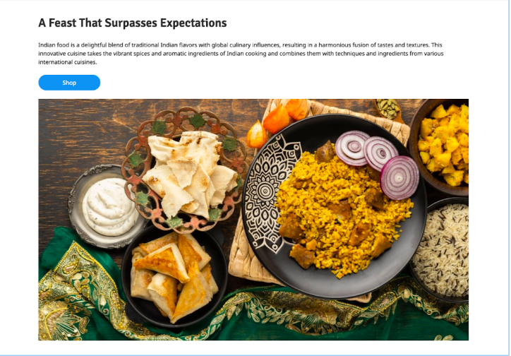
4. Spotlight your success
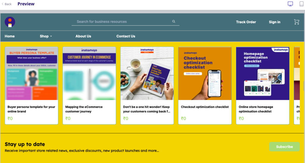
Highlight a product, testimonials, or product showcases, showcasing the very best your store has to offer.
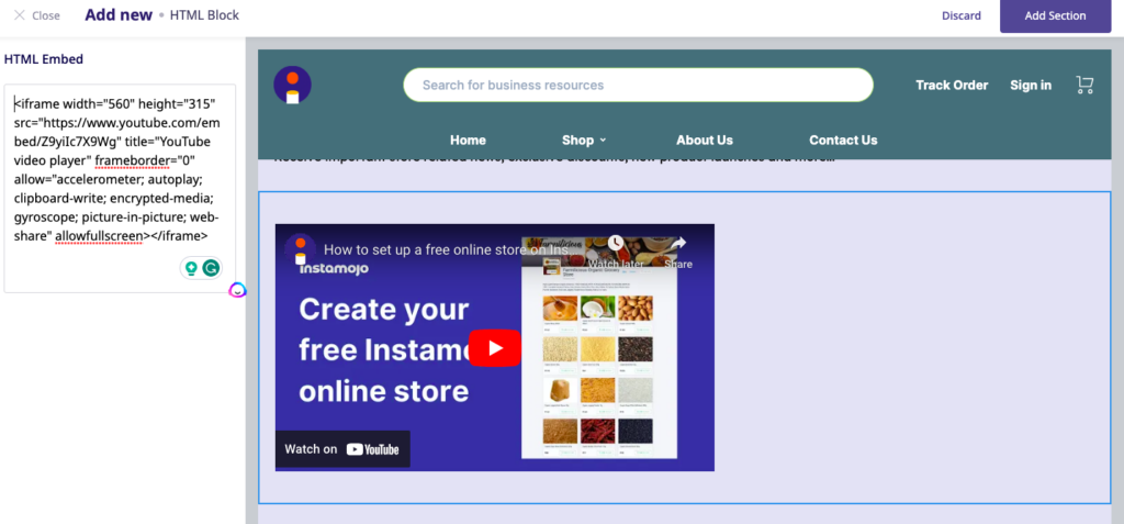
5. Get creative with HTML Blocks
Insert custom scripts for popups, countdown timers, embedded social media, and more on your online store homepage for added functionality and appeal.
6. Rearrange to perfection
Rearrange the sections to suit your brand’s visual, ensuring a perfect balance of aesthetics and functionality.
7. Simple and easy editing
Conveniently add banners, testimonials, logos, and more, all in one place. This streamlined editing experience saves time and makes things simple and smooth.
Get the best out of this feature
Your online store is your online salesperson. When it comes to an online store homepage, there are several must-have elements that contribute to its effectiveness and user experience.
Here are 10 must have’s for your eCommerce website’s homepage:
1. Clear and compelling value proposition
Your homepage should clearly communicate the unique value and benefits your brand offers to customers. A strong value proposition can increase conversion rates by 34%.
2. Eye-catching visuals
High-quality and engaging visuals, such as product images and videos, can capture visitors’ attention and encourage them to explore further. Rich visual content can increase conversion rates by up to 86%.
3. Intuitive navigation
A user-friendly navigation menu allows visitors to easily find products or categories they are interested in. Simplifying navigation can reduce bounce rates and improve user satisfaction.
4. Prominent search bar
Including a prominent search bar on the homepage enables users to quickly search for specific products, enhancing their browsing experience.
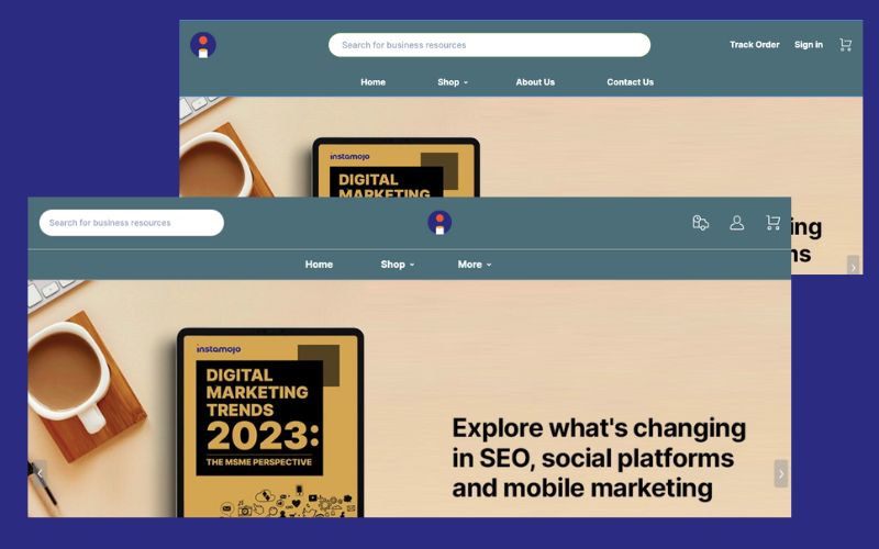
You can see how we have experimented with two different layouts for the header of our eBook store. On one hand, we tried a centrally located prominent search bar, and on the other, our brand logo takes centre stage.
5. Featured products or deals
Highlighting featured products, top sellers, or special promotions on the homepage can attract attention and drive sales. Displaying popular products increased conversion rates by 20%.
6. Customer testimonials
Including customer testimonials or reviews on the homepage can help build social proof and trust. 92% of consumers read online reviews before making a purchase decision.
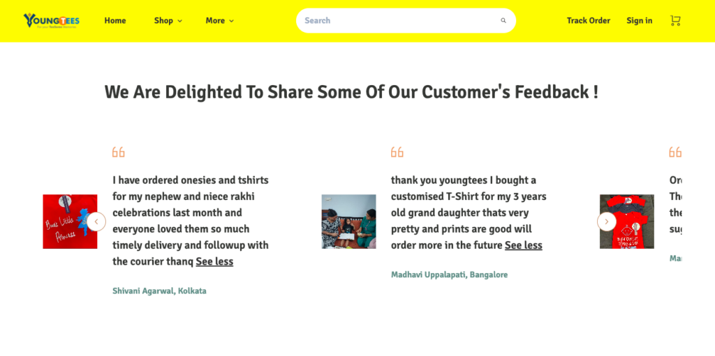
Look at how this online store: Young tees is showing the love that they have been getting on their homepage.
7. Trust signals
Building trust is crucial for online shoppers. Showcase trust signals such as secure payment options, customer reviews, trust badges, and guarantees to increase credibility and conversions.
8. Call-to-Action (CTA) Buttons
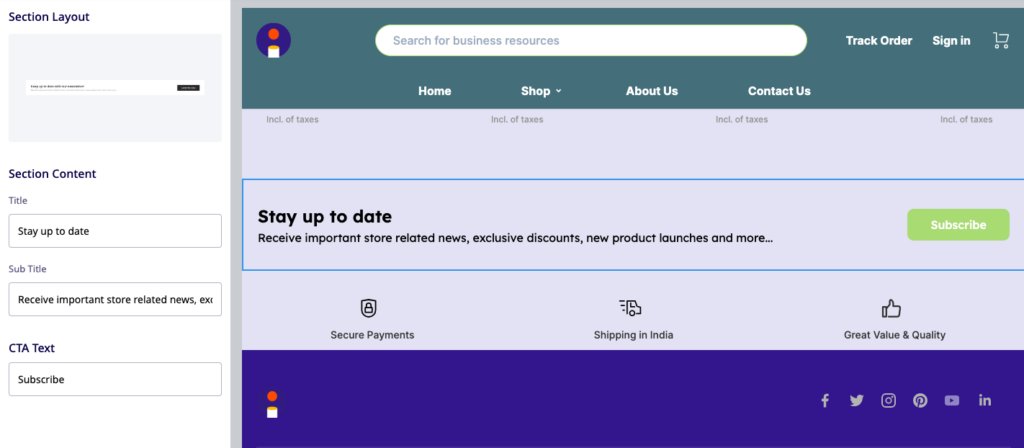
Utilize well-designed and strategically placed CTA buttons to guide visitors towards desired actions, such as “Shop Now” or “Sign Up.” Prominent CTAs can improve click-through rates and conversions. Here is a quick guide on effective call-to-action buttons with live examples.
9. Mobile responsiveness
With the growing number of mobile shoppers, ensuring your homepage is mobile-friendly is crucial. In 2022, mobile commerce accounted for more than half (52.2%) of total eCommerce sales worldwide, making it imperative that your homepage is optimized for mobile devices.
10. Contact information
Displaying contact information, including email, phone number, and customer support options, helps build trust and enables customers to reach out if needed. Don’t forget, your social media handles should be easily available too.
See how our eBook store’s footer has the necessary social media links along with trust badges that say “Hey, we are authentic”.

Here is a complete guide for a eCommerce website home page with high conversion rates
Create a homepage that reflects your brand
First, let’s access the builder view.
To access the builder view, login to your dashboard and navigate to “My Online Store.”

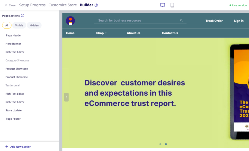
The builder offers various page sections that can be customized according to your needs.
Here is a complete list of page sections that you can add, delete, or modify for your homepage.
Page sections
- Page header
- Hero Banner
- Rich text editor (The rich text editor option is currently accessible exclusively to users who signed up before the builder’s launch)
- Category showcase
- Product Showcase
- Text
- Image+text
- Testimonial
- HTML block
- Store updates
- Footer
Here are a few ways you can play around with these sections:
Multiple layout customization options
Users can select from a wide range of custom layouts for every section on the home page.
Here’s how you can change the layout of different sections such as the Page header section, Hero banner section, Product Showcase sections etc.
Click on the edit icon for the section you want to modify, and you will find an option to change the layout. Browse through the available layouts and select the one you prefer. You can follow the same process for other sections as well.
Adding New Sections
To add a new section to an existing one, click on “Add a new section.” Select the desired layout, configure the settings for the new section, and save your changes.
Re-order a section
To reorder a section you can simply drag and drop the sections in the left-hand side.
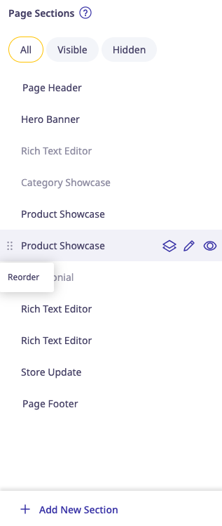
Sections filters:
The builder platform provides options to filter sections to view all, hidden, or visible sections.
Real-time Preview and Responsive Design
Any modifications you make on the left-hand side of the builder platform should instantly reflect in real-time on the right-hand side, allowing you to see how your changes affect the appearance of the home page.
Customise fonts and colours
Choose the colours, fonts, and call-to-action button designs that suit your brand style. You can select all of these from the “Customise” section of the online store editor.
Now that you have complete freedom over how you want YOUR online store to look, the only thing stopping you is your imagination!
Final pointers to remember
- Choose what your customer wants to see over what you want to do
- Be aware of your brand guidelines
- Make it as rich in high quality imagery as possible
- Do not forget SEO: Here’s a guide
The builder feature is available to ALL users except those using the “Simpar” theme. However, those on the Lite and starter plan will have restricted access to all the sections and their respective layouts.
To fully unleash your creativity and stun audiences – upgrade to a premium account at just Rs 10/day!

