Did you log into your Instamojo Account lately? If not, do it now because we went to the drawing board and created a fresh new dashboard, specially for you.
What’s new in your Dashboard?
Mobile
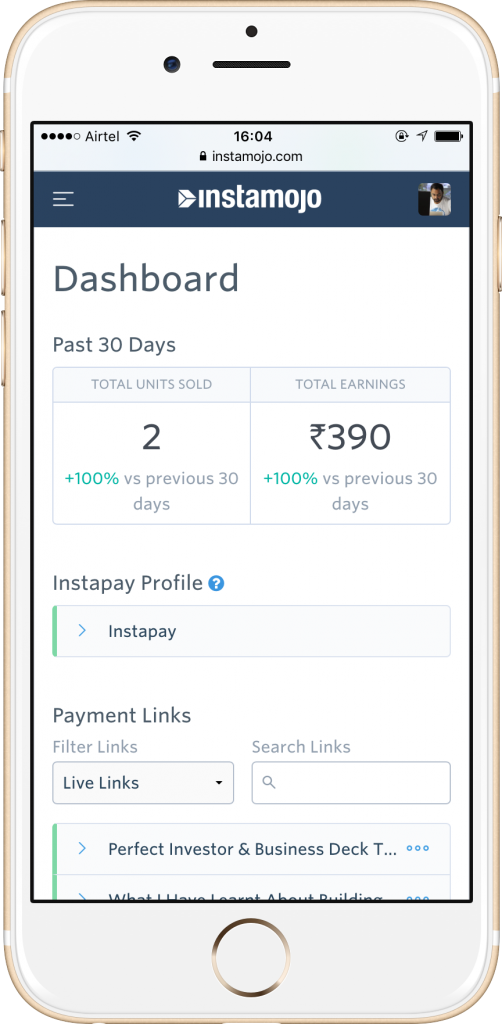
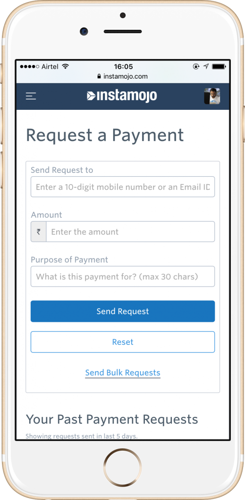
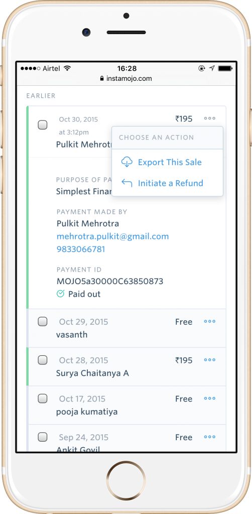
One of the biggest considerations in the new design is how it adapts to mobile devices. The site has been redesigned with a card-based layout and is now fully responsive. Being responsive – the site functions equally well across all devices be it a tablet, mobile, or desktop. Every page and every unit (Eg: A transaction “unit” in ‘Sales & Customers”) adjusts according to the device being used – making it render beautifully while being fully functional.
Around 10% of our dashboard visits already come from mobile devices. With the new design, Instamojo merchants can conveniently access the site on the go and don’t need to drag their laptop to the toilet anymore.
A Better Information architecture
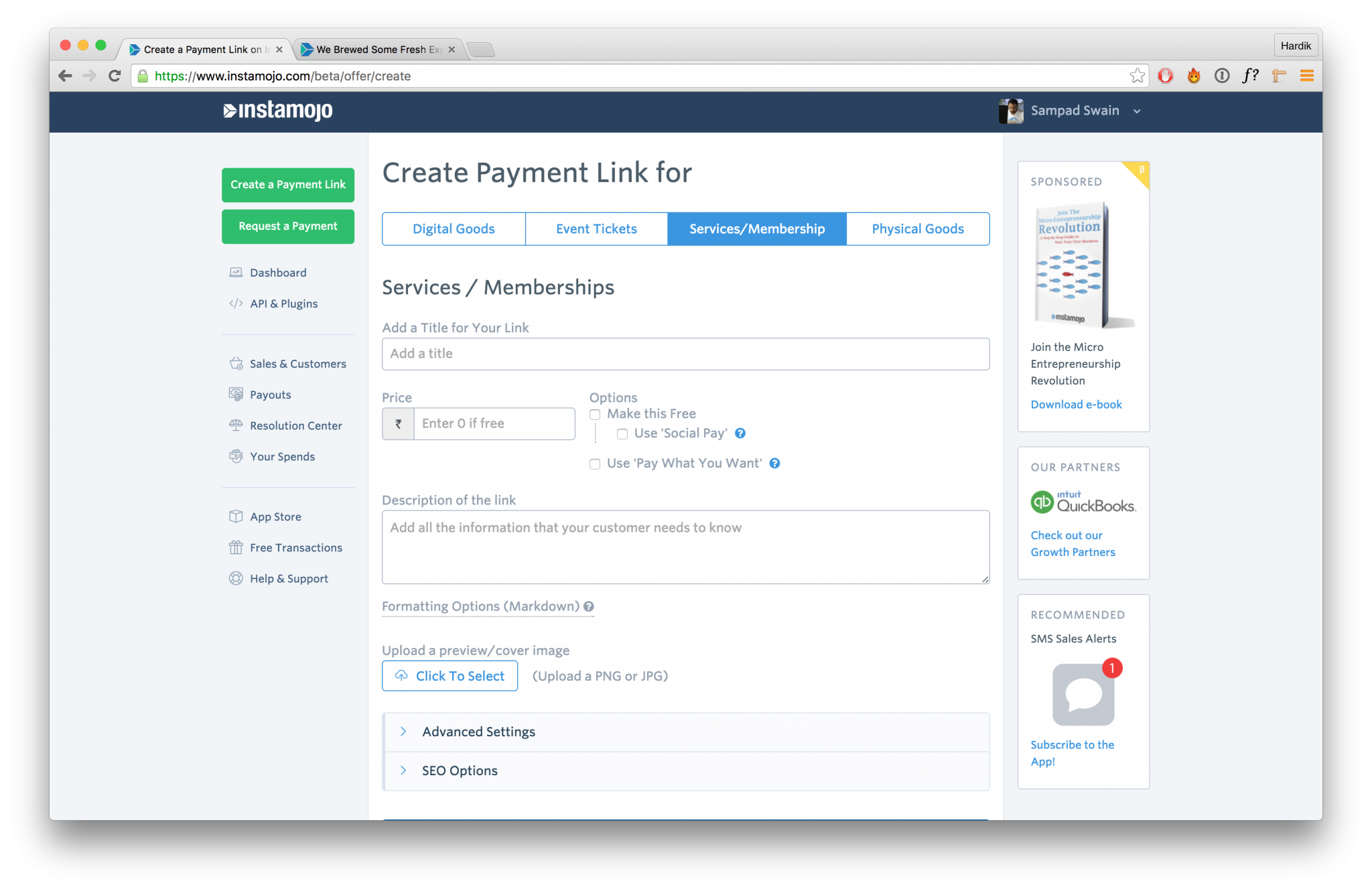
The left navigation bar contains the most important parts of the site.
Two buttons at the top left highlight your most important actions
– Creating links & Requesting payments
The left navigation follow the rough structure of a sales cycle:
Pre-sales – Buttons, API, Dashboard
Post-sales – Sales & Customers, Payouts, Resolution Center, Your Spends
Additional tools – App Store, Free Transactions, Help & Support
Less frequently accessed items are now in a new user dropdown.
Single page App
The site is now an API based Single page app.
Which means: Earlier, opening a new section or making a link inactive would reload the page. Now your content magically appears without a refresh (technology can be amazing right?!), this also generally makes the site faster.
New API & Plugins section
This is a one stop shop for developers integrating with Instamojo. The new API & Plugins section contains our API documentation, language libraries and platform plugins along with details like private key & token in one place.
Promotional units
With the new Design, we have placed a section for you to hear about latest Instamojo features, useful promotions, etc.
This visual upgrade was the first step towards a broader effort to revamp the merchant experience on Instamojo and we’re just getting started. Over the next few months, we will be going section by section and improving the user experience of the entire site.
Stay tuned!
Till then, let us know what you think of your new dashboard. Love it? Hate it? Want to give us a piece of your mind? Tell us all – We’re waiting!


