Instamojo.com launched the shiny new dashboard less than a month ago. It was a stellar effort from the whole product team that worked hard for more than 4 months. Developers spent their time rewriting the complete code-base from scratch to construct a framework for the future while the Design team was busy spinning out the new revamped designs.
In this detailed article, I’ll explain how Design team at Instamojo came together to redesign the dashboard and how we normally function to efficiently take a product/feature idea from ideation to deployment.
(Brace yourself, this is going to be long, but I’ve made it worth your time.)
Brand new dashboard
If you’re an Instamojo user, you’d have seen the new dashboard by now. We’re really proud of the work we put in there.
As you know, we help merchants sell & grow their business online. For this, requirements from the products are pretty clear — users need to see their data at a glance and they need to take a small set of actions on top of the data-set.
Each section of the dashboard is designed with the concept of User Missions.
A User Mission (UM) is a task/problem/goal a user wants to achieve with the help of that particular section of the product. Once that mission is clearly identified & defined, that section does nothing more, nothing less.
This makes the product easy to understand and transparent. Once you start using the new dashboard, you’ll see that there’s been deliberate effort put to keep things clear and focused.
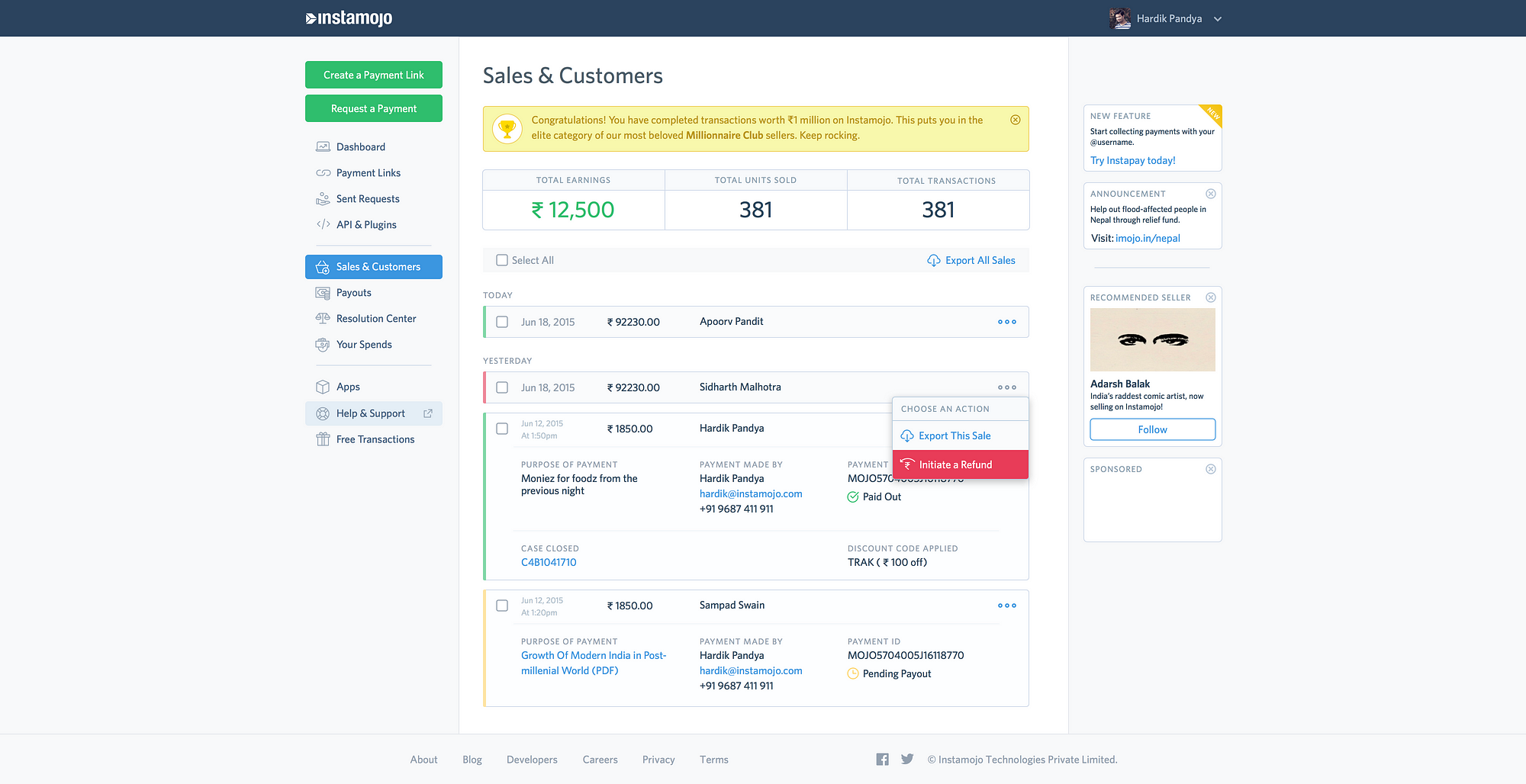
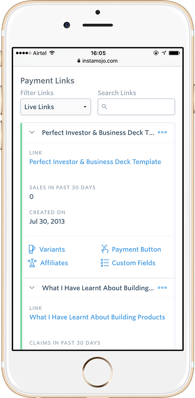
Cards — We started with a card-based approach for the whole redesign. By organising information in cards, it becomes quite easy to port the whole design well to all screen-sizes and on all devices. Cards are also conceptually easy to understand. Our new dashboard uses cards quite generously for displaying all kinds of information around sales & customers, resolution center, payouts, payment links and more.
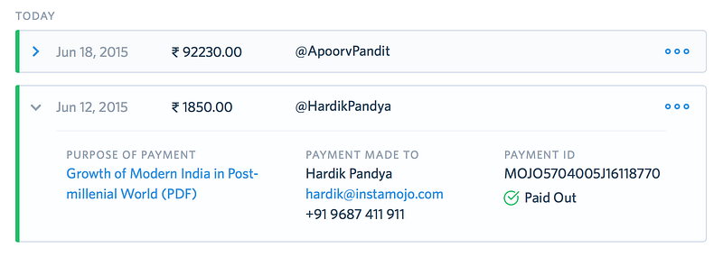
As you see in the image above,
When a card is closed we show contextual information that is sufficient for you to get an idea of the particular element. When you want further metadata around that event, you expand the card to reveal it.
One little delight we added here was contextual left-edges on cards — these left-edges are colour-coded to denote different states a card could be in, depending on the section of the dashboard.
- In Sales & Customers, this edge denotes payout status (green is paid out to seller’s bank account)
- In Resolution center, this edge denotes a case’s ongoing status
- In Dashboard, this edge denotes a link’s status (green is live, red is inactive)
Love the way it shows yellow in the new @instamojo layout for “not paid out” txns. Real attention to detail and great UX. @sampad@gehani
— Deepak Kanakaraju (@digitaldpak) January 1, 2016
We were quite happy to see our users appreciate it!
Data Meters — This is another UI element we introduced to display un-actionable numbers around your online business. We figured our sellers love checking health of their business at a glance and these numbers really help them do so. Below is an example of one such meter that works well across devices of all sizes.
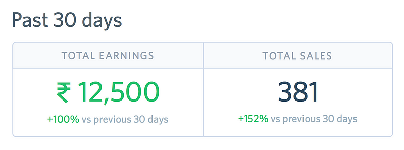
We plan to put even more intelligent automation at work to provide better insights using these meters. Stay tuned for those!
Layout — Layout was another thing that went through a major change. We experimented internally with a couple of different layouts. We wanted to give it an analytics-y look and tightly couple the shape of the site to a highly-focused container.
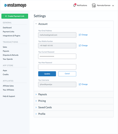
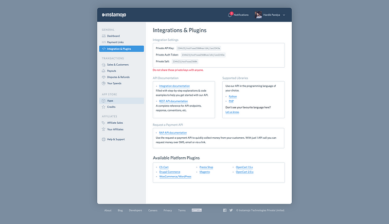
We decided to make our site wider in layout and introduce informative units that could help the seller learn more about various peripheral features Instamojo offered.
An ancillary benefit of this space was to use it for feature announcements and promoted content as well.
Hence, we agreed on going ahead with this wider layout experiment and divided the screen in 3 different parts — navigation, main content in the center and right side units.
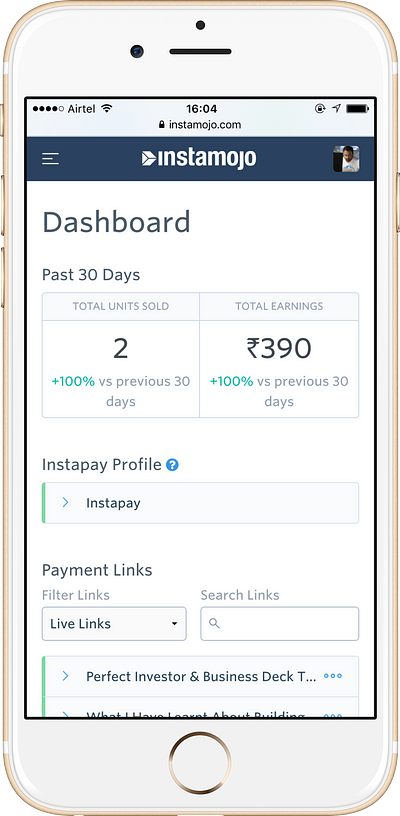
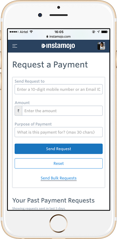
So this gives you a fair bit of an idea on what kept us busy for the last half a year. We are completely revamping the whole Instamojo footprint on the web. It started with the homepage at Instamojo.com and has now refreshed the dashboard. Up next are all the current landing pages (About, Team, Career and Culture pages will drop in the coming weeks).With 2016, Instamojo is going to be bigger than ever before and we’ll be taking even bigger bets on the product backed by significant advancements in development and design ethos.
With this, I’ll go in detail about how we internally function as a design team with in-depth information of processes and flows.
Laying the right foundation
Instamojo grew by almost 100% in its size in 2015. As we started growing our team, our design philosophy and language needed defining. There was no clear structure to our work with a lot being done ad-hoc without any documentation. With a growing team, this could mean things can quickly go out of hand with multiple brains working independently.
We needed to sanitise the way we worked.
The guides
Our design team unanimously agreed early (April 2015) on that we required a design framework for the whole team. We started with a simple style-guide Sketch file. Our expectation was that this document would serve as the ultimate reference whenever one was needed.
We made a plan to have in total, 3 guideline documents —
- UI style-guide
- Content guide
- Brand & Marketing guide
For UI style-guide, we already had a list of components we’d need to redesign from our old website and hence it was easy to get started with.
I’d share some examples of how we spec’d our UI components in the style-guide document so you can get a general idea about it. After finalising on the colour-palette for our UI, I got started on the UI style-guide.
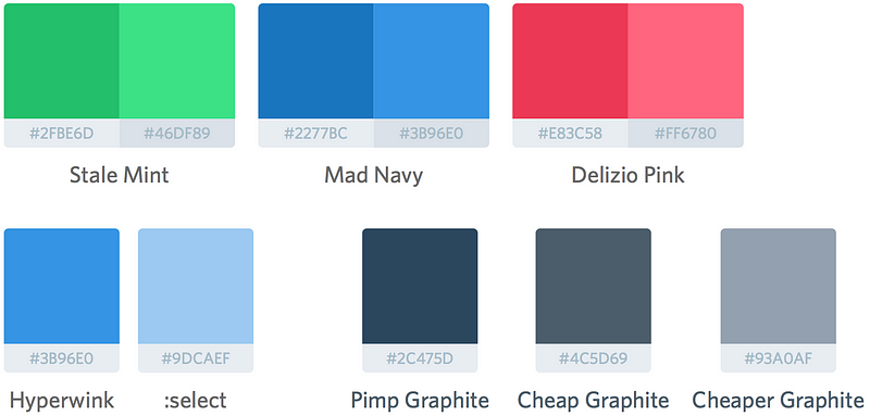
In our initial weekly design meetings (more on this in a bit), we ramped upquick internal feedback on initial mocks of new redesigns of UI components to have something to start with. This sped things up immensely in getting started with new dashboard designs.

As you see, every UI component was spec’d out completely right down to the last pixel in order to keep things uniform across the product.

Early investment in standardisation of design components & building blocks meant we spent incrementally less time in spinning out layouts for our new features and pages.
Content, Brand & Marketing guidelines — As I am writing this, we’re in the process of finalising these documents. We plan to integrate them vertically across the whole company and bake them into our employee-on-boarding flow in order to educate new folks about who we are and how we present ourselves to the world.
We maintain these guidelines on Google Docs with limited editing rights in order to maintain sanity and accountability. It’s shared with the whole organisation.
Design process
As they say, you can never be optimising enough. We started out with a clear goal for our design team —
We are our sellers’ advocates and we vouch for simplicity and usability in the product to make their lives easy.
Working with this ethos made ‘being on the same page’ really easy. It also became a quick checker to resolve conflicts amongst ourselves. Whatever wasn’t usable and simple had to go away. We are a team of 3 designers who work with a Product Manager. All 4 of us decided we needed a way to sync up and in general talk/discuss more about our work and the feedback we were getting. Weekly design meeting was the way to go.
Every Wednesday evening we’d meet for at least an hour in a separate room with a clear agenda —
- Discuss user feedback from the last user-testing interview session if any & come up with actionable notes
- Discuss mocks and design progress from each designer
- Jot down individual feedback and do Q&A on design choices
- Discuss upcoming user-testing interview session if any
- Individual deliverables for the next week
Occasionally, we’d prepare a questionnaire for the developers and invite them to our meeting to clear our doubts about what was possible to build and what wasn’t.
One of the most critical things we did starting out the redesign was to keep the Developers on-board in the process to keep a reality-check on the designs we made.
Below is the flow we use for a typical design-to-dev sprint. It’s been serving us really well up until now and we’re sure with some more optimisation, we’d be even more efficient.

Instamojo recruits some of the best people in the industry and by giving them freedom and power to operate on their own brings the sense of autonomy and ownership to their work. This shows in the resulting product and the overall philosophy of the organisation.So yeah, this is how we work at Instamojo in the design team. I am sure we’re not yet as optimised as we could be but we’re getting there. We’re taking steps in the right direction to reduce a feature’s time-to-user. I am extremely proud of our design culture inside Instamojo and of all my colleagues for fostering such an enterprising environment that breeds creativity and freedom of thoughts.
Design team
A huge credit to the design team here —
- King Sidharth
- Namrata Kannan
- Hardik Pandya (yours truly)
I’d also like to take this opportunity to thank my colleagues Dalan Mendonca(Product Manager) & the Dev team consisting of Aakash Goel, Sanath Chandra, Indradhanush Gupta and Ashwini Chaudhary who’ve been instrumental in getting stuff done to bring the new Instamojo at the screen near you. Without their constant vigil, all this wouldn’t have been possible.
We’re constantly look for feedback. In case you find anything broken or want something to exist that we missed, ping me at hardik@instamojo.comand we’ll talk about it.
The good work doesn’t stop here
There’s a ton of incredible new features coming your way including a brand-spanking-new online store, smart-search, rich data-exporting capabilities, app store app add-ons and other offerings on business insights front.
As our CEO Sampad Swain says,
“2016 is going to be awesome, and we want you to be a part of it.”
Note: I have originally published this article on medium. If you wish to read more on Design, follow the link below:

