With the growing challenge of capturing people’s attention, it’s more important than ever to focus on optimising your landing pages for better conversions.
Landing pages are your means of generating leads, revenue, or both for your business. So, make sure you invest time to create a page that attracts, retains, and converts your target audience.
In this blog, you’ll find out what an ideal landing page should have, tips to improve your page and get more visitors to sign up, and examples of good landing pages.
Learn about the Instamojo free landing page builder. Talk to our team directly.
The basic elements of an effective landing page
Landing pages are single-page web pages which are used to encourage visitors to take an action such as buying your product or subscribing to your email list. An effective landing page has the following elements:
1. A headline: Convey what your page is all about with a heading at the top. You can also use an optional sub-headline for further explanation. Make sure your headline is not more than eight words.

2. A description: Emphasise the value of what you offer with a brief description. Write about the most important aspect which your audience cares about.
3. Visual elements: Add an image which supports the landing page content.
4. An element to capture visitors: You need to lead your landing page visitors to smoothly take action: make a payment or give you their contact information.
These are the must-have elements for a landing page. Now, there are a bunch of supporting components that you can add to make the page more legitimate:
5. Elements of trust: Testimonials, security badges, Awards
9 tips to create a high-converting landing page
Here are a few tips on planning and designing your site for boosting conversions.
1. Focus on only one offer
A landing page needs to give your visitors a clear understanding of what your product/service is all about and capture their attention. So, multiple offers on a single page might do more harm than good.
For example, if you’re a baking business, and your page is about both your baking classes and cake selling part of your business, your page visitors get distracted and confused. A landing page without a clear offer will result in lesser conversions.
2. Highlight the values
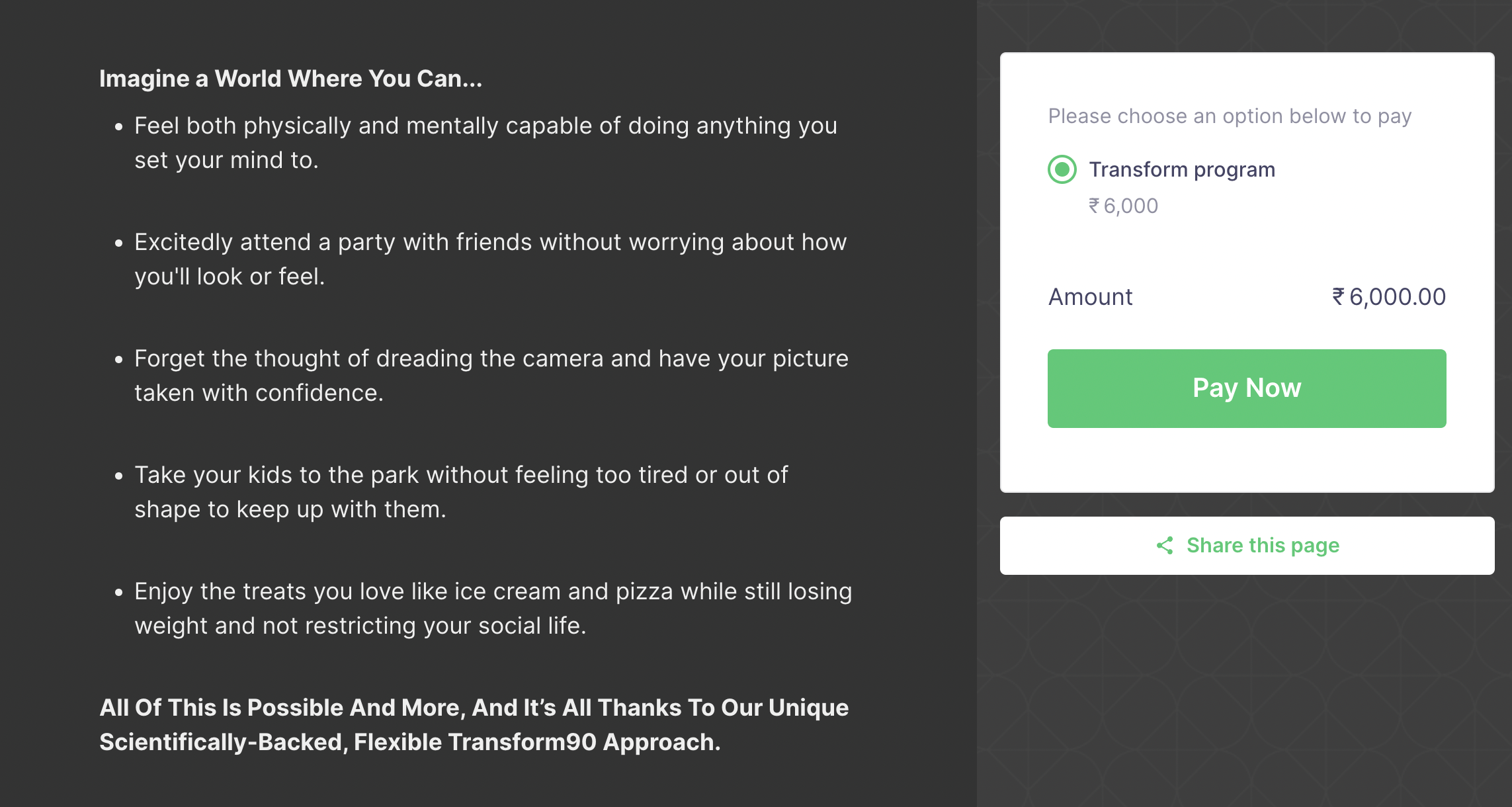
Emphasise the benefits of the offer with a brief description. You can use a paragraph and/or bullet points to convey your message. If you want to include more details, consider adding a video with a further explanation of the offer without cluttering up the page.
Focus on the pain points of your target audience and describe how your offer solves it.
Here’s an example of how a fitness program talks about the benefits of enrolling in it:
3. Bring in trust elements
Now that you know how to present your offer, let’s look at how you can build credibility.
As described in the first section, trust elements are completely optional for a landing page. But it can make a huge difference when it comes to conversions.
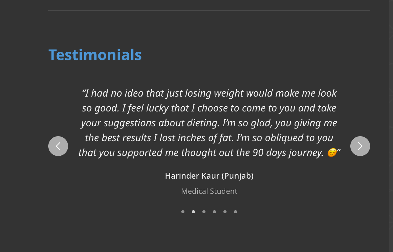
When was the last time you bought something online without looking at reviews? Unless the brand is extremely popular, reviews play a very important role in buying decisions. In a survey, only 5% of buyers responded that they purchase products online without looking at reviews or other kinds of social proof.
Add testimonials to your landing page content. Collect them from previous customers who had signed up for the same service. If you’re selling for the first time, you can include offering a free sample to a segment of people and use it to drive sales.
Want to know more about building trust with customers? Grab our free survey report on eCommerce trust.
4. Make it visual
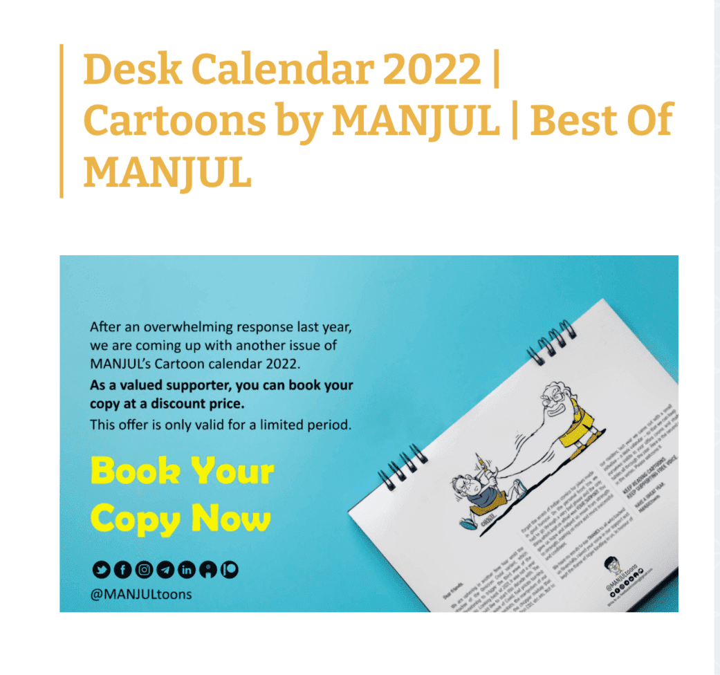
We all know that a page with just words doesn’t look attractive enough. And it doesn’t bring good conversions either. People process images 60,000 times faster than words. This means that visuals are not just attractive, they’re powerful and can bring in conversions faster.
Of course, the image should be relevant and match the offer so that your buyers aren’t confused.
A great image for your landing page can be:
- A screenshot of the webinar
- A graphic design stating the discount available
- An image of your previous class/program (if offline)
- A collage of famous people who have enrolled in your program
You can also include videos related to your product or embed a YouTube video.
Here’s an example of a visual element done right on a landing page:
Want to look at other businesses for examples? Here’s a compilation of the top landing pages created by Instamojo’s free landing page builder.
5. Match copy with ads
Make sure that the promise stated in your ad copy matches the offer on your landing page.
For example, if people click on a CTA for a free offer only to find out there’s a catch on the landing page, you’ll instantly lose their trust. Consistency is tied to better conversions. Avoid confusion both on your promotional material and your page content.
Here’s a blog on writing winning landing page copy.
6. Clean, minimalist design
We talked about how appropriate visual elements drive conversions.
The best landing page has a simple and minimalist design. You don’t want to distract your visitors with graphics and elements that take up their attention.
When you create a landing page with the Instamojo Smart page builder, you can choose from a range of minimal themes. You can also customise the theme colours according to your brand image.
7. Mobile-friendly site
Having a mobile-friendly site is not enough anymore – it needs to be optimised for speed. According to a study by Deloitte, users of an online shopping site increased by 8.4% when mobile site speed was slightly optimised.
This means that you need to make sure that your landing page must be mobile-optimised along with all the other features.
If you’re wondering how you can be sure that the landing builder you choose comes with this feature, we’ve got you covered. With the Instamojo landing page builder, you don’t have to worry about optimising your site. It comes with a mobile-friendly user interface so that you can easily launch your business and start getting conversions.
8. Encourage sharing
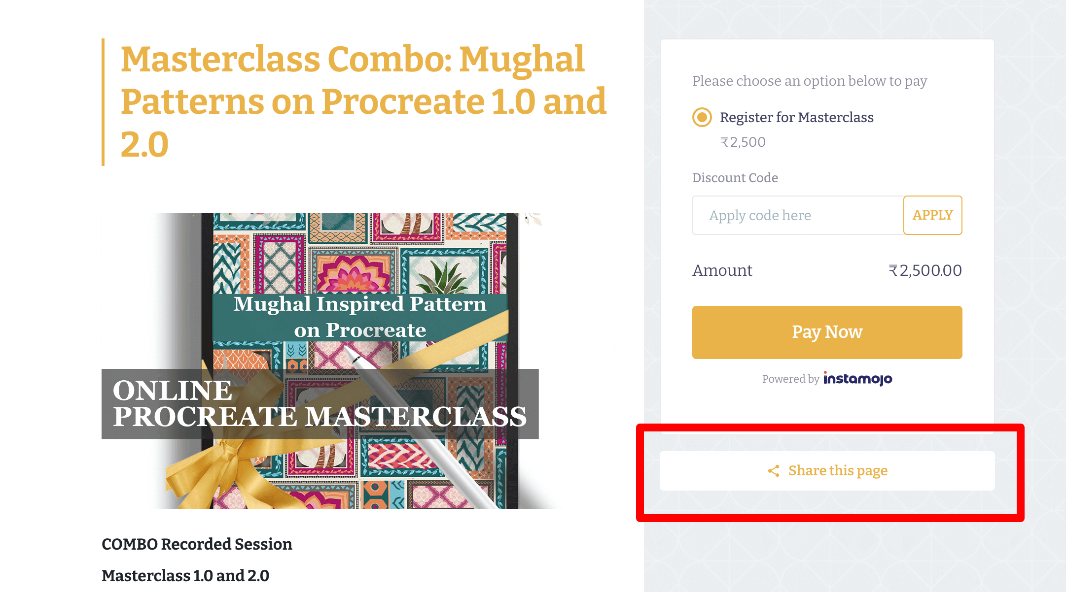
Keep in mind that even if a visitor doesn’t buy from you, there’s a chance that someone from their social circle will.
So, include social media sharing options that enable your prospects to promote your landing page. To keep your page minimal, it’s best to include a single button.
Related read: How to start a successful coaching business online
9. Check your analytics
The best way to grow your business is by tracking how well your page is doing with the help of solid numbers. You can then use this information to make smarter business decisions.
For this, you need to track the following metrics on your landing page:
- Where visitors clicked on your page
- How long have visitors stayed on your page
- How many visitors converted to leads
You can get insights on your landing page activity either by integrating Google Analytics tracking or with in-built analytics that come with some landing page builders.
Your landing page checklist
Now that you know the basics of a landing page and tips to improve conversions, here’s a checklist you can follow for the next landing page you build or optimise:
- Do you have an attention-grabbing headline?
- Do you have a relevant and compelling image?
- Is your call to action clear?
- Is the content clear and concise? Does it explain what the offer is without confusion and why it’s beneficial?
- Did you add social proof?
- Have you removed potential friction and distractions from the page?
Looking to create a landing page which also helps you get conversions? Create one with Instamojo Smart Page Builder for free and get started.

