Writing good landing page content is not rocket science. But, it is not child’s play either. There are some proven techniques that when employed can show higher conversion rates. And isn’t that the goal of every landing page in existence?
We have 8 simple but effective techniques that can help your landing page see insane conversions. Let’s get to it.
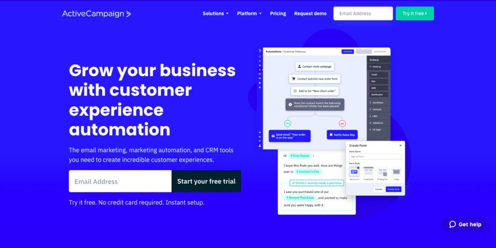
A captivating headline is a must
The headline is the hook nail and sinker of a landing page. You usually have about 3 seconds to make an impression. And if your headline doesn’t immediately offer relevant value to the visitor, they’ll just leave.
A good headline is also relevant to who you are targeting. Sometimes you may need to tweak the headline and personalise it. But if you are just a beginner, focus on getting just one thing right –
Your headline needs to either:
- Convince the visitor of a benefit
- Solve a pain point or a problem
- Hook your readers in to keep reading
And remember – the placement of the heading is important. If the heading is not immediately visible when someone lands on your page, they will have no reason to explore or stay.
Good headlines are always in the hero fold of a landing page. This is the section that a person sees when they first land on the page and they haven’t scrolled at all.
Crisp value proposition
Once the headline clearly hooks the person in, it’s up to the rest of the content to ensure the visitor converts.
You can write paragraph after paragraph, but if it doesn’t appeal to the consumer, the effort is not worth it.
Experts always suggest ‘selling the benefit’ and not the feature. Consumers will not care about what cutting-edge features you introduce unless they know how it benefits them.
Here are a few things to note:
- Sectioning off content with sub-headings tells the reader which paragraph has information they need
- Stay crisp with frequent use of bullet points
- Images need to be high quality and should load quickly
- Numbers and statistics will help you make your case
- If the landing page is long, the CTA position is important (CTAs can make or break your landing page intent. But we’ll come to that)
Whether we like it or not, all online visitors first skim through the landing page. In that case, you have to make your point with clarity and quickly. The content should be easily scannable.
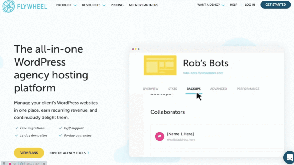
Always remember, if a person is skimming the landing page, they are primarily going to focus on:
- Heading (maybe the subheading if it’s jargon free)
- A single CTA
- Testimonials
- The hero image/video
- Your value proposition
This anatomy of a landing page by Unbounced should help you understand the 5 core elements of a landing page in detail.
Write landing page content that answers ‘Why you’?
A landing page allows the reader to create an impression of you without having to go to different links or pages.
The content should be able to assure the reader –
- The services/products are going to be worth it
- Your credibility as an online seller
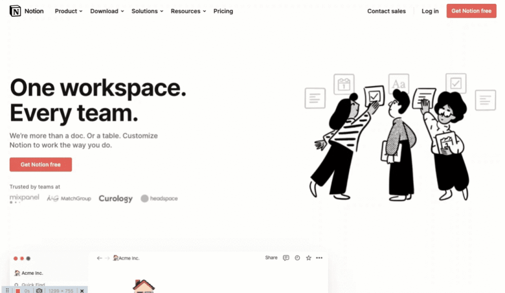
To help the reader reach a faster decision about engaging with you, your content should follow these tips:
Thoroughly know your target audience:
Know what they like and what they want. Clearly express why YOU are the best person to give them not only what they want, but what they “need”.
If you can predict their main pain points, fears and objections, write landing page content that aims at disproving these.
Social proof is powerful
Testimonials from people who have bought your product or service are crucial in letting newcomers know what to expect. Encourage people who have engaged with you before to leave detailed feedback that you can display on your landing page.
Ensure that the reviews are not fake and that the customers have their names (and if possible designations) displayed.
Be human
Don’t you hate it when you just want some simple answers, and all you can find is jargon? There’s a reason that the featured snippet on Google is such a popular feature. It tells you what you need to know quickly and in the shortest way possible.
When you are writing landing page content, understand who is reading it. The best way to communicate is to write as you speak.
You may want to use difficult words, or technical terms, but ask yourself is it really necessary? Is your goal to impress your reader with your vocabulary? Or is to sell your product and service.
By writing like a human, you make it easier for the reader to connect to you. The online visitor is engaged for longer and takes lesser time to come to a decision about engaging with your landing page.
Be concise. Be crisp. And be polite.
Stay consistent
Nothing is worse than a landing page that looks like 4 different people worked on it. We already discussed that your content should be scannable. Inconsistency can be very distracting to the reader.
Not only that, it comes across as unprofessional and amateurish.
If your brand has its own colours (which it definitely should), then your landing page should also reflect the same. Consistency in visual representation builds credibility.
Stay consistent with the grammar you use, the tone, the value proposition and your CTAs. You cannot be super casual and friendly at the top of the landing page, but then adopt a tone that is cool and business-like by the end.

Craft the perfect CTA
A Call to Action button is your single point of contact with your online visitor. The call to action (CTA) will determine what action the online visitor takes when they read your landing page content.
If they do what the CTA says – congratulations you now have acquired a lead! But if the CTA falls flat, or doesn’t convince the reader, all your effort into building the landing page goes to waste.
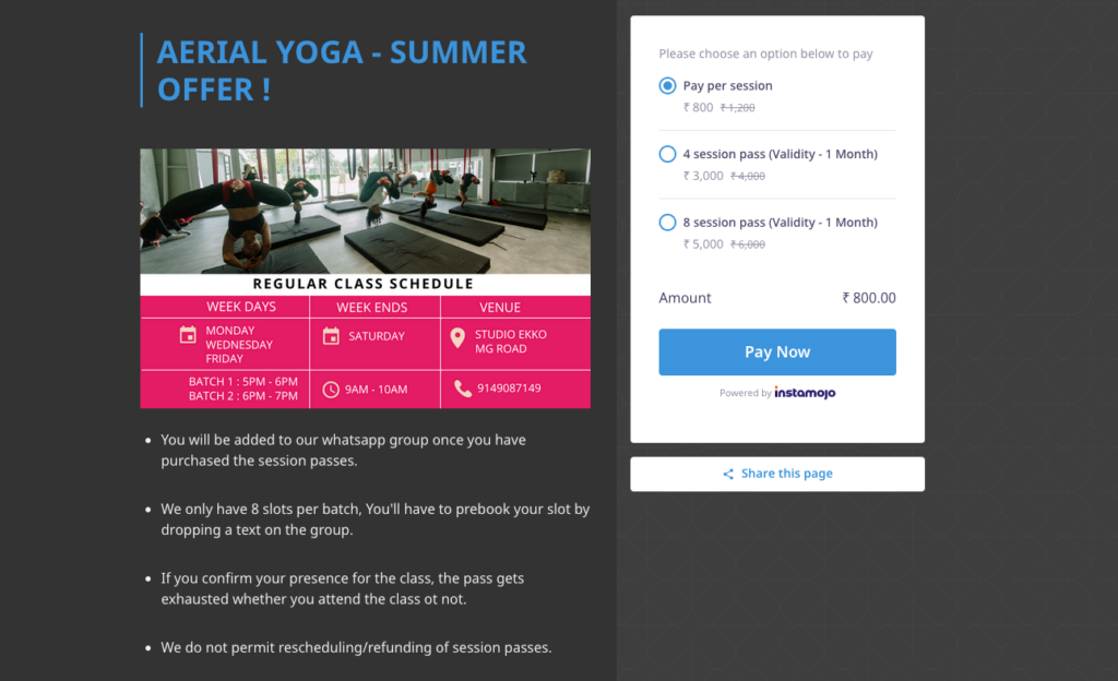
Here are some golden rules when it comes to crafting an effective CTA:
Placement
The CTA button should be easily accessible to the online visitor. Essentially it should be “right there” when the reader comes to a decision.
Colour scheme
The right colour scheme of the CTA helps attract attention to it. A good practice is to have it in contrast to the landing page colour. The font colour and size within the CTA should also be clearly visible.
Stage of the funnel
It is also important to understand what stage of the marketing funnel your landing page caters to. If you want your online visitor to know about your products and services more before committing, the CTA should do that. If you want your online visitor to finish a purchase, that’s what the CTA should ask for.
Language
This also depends on your understanding of the customer, the tone for your entire landing page and your end goal. You can choose to have direct CTAs like purchase now, add to cart, register, subscribe etc. Or you can take the creative route by hooking people in with CTAs like, Get awesome now, Are you ready for a wild journey? Let’s go for a ride, etc.
Related read: 9 effective Call to Action examples that see high conversions
A/B Testing
A/B testing refers to the practice of showing the same landing page to different people, but changing/tweaking one key element in your landing page content. This allows you to make improvements on your landing page based on hard data.
For example, you can keep the main body text the same, but experiment with different headlines to see which gets more clickthroughs. You can test out different CTAs to check conversion rates. Here are some other landing page elements you can change for your A/B tests.
Continuously testing with different elements helps you understand your target consumer better, and get more conversions.
Write landing page content that has a singular goal
Your entire landing page should have a consistent message. That means, the CTA should also be consistent. If you’re selling event tickets, a singular CTA to purchase the ticket should be visible clearly.
Human attention span is reducing as it is. Don’t confuse them further by dividing and pulling their attention with different CTAs. Your landing page content needs to be laser-focused on one single desired outcome.
Now that you know the basics of writing landing page content, let’s get to it.
Start turning your online visitors into customers with Instamojo Smart Pages – The easiest landing page builder.
Want to know the full range of benefits of our Smart Pages? Talk to our team and get your queries answered! Set up an appointment here.

