You might have your favourite colour. But do you know why you like that colour? Scientists for decades have researched the different qualities of colours and the different emotions they induce.
This is why business owners also often use colour psychology to influence their conversion rates. Want to know how you can apply this to your eCommerce website? Keep reading.
Why does colour psychology matter in eCommerce?
We already might know red is bold and blue is calm. But can these colours also be used to influence the decision of a consumer? Yes, it can.
A consumer usually takes less than 90 seconds to decide if they are interested in a product. And 90% of the decision depends on the colour of the product itself!
The colour that you choose for your eCommerce website can actually help your consumer not only understand what values your brand stands for but also the kind of emotion that they should associate your products with.
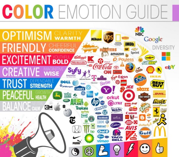
We usually remember the red used by Coca-cola and Zomato, the green used by Apollo Pharmacy or the black aesthetic of Boat lifestyle. We remember these colours because the brands have been consistent in using these colours throughout their marketing campaigns.
Related read: The Do’s and Don’ts for the perfect eCommerce website
How to choose colours for your eCommerce website
Colour psychology is the study of how colours can influence human behaviour. Especially in eCommerce, research has shown that the colours you choose and the locations you decide for them can have an impact on your conversion rates.
Data by Kissmetrics also proves that brand recognition can improve by as much as 80% when you are consistent with your brand colours.
View this post on Instagram
Here’s a breakdown of what different colours could mean, and different brands that have utilised colour psychology in eCommerce.
Red
Red stands for power, energy excitement and passion. Try to not use it too much as it can get overpowering. Use it in places where you would want to draw attention.
See how Boat, an electronics brand, uses the colour black and red for contrast. The red has strategically been used in certain areas. The energy and vibe of the website are bold.

Brown
Brown is a very earth tone. It’s great for e-commerce stores that sell organic products online. It could be food, herbal products etc. Brown also shows reliability and strength.
Yellow
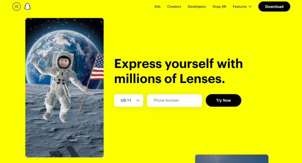
With yellow, you can immediately think bright! It’s a colour that symbolises joy. A very inspiring colour this is often used to express happiness, optimising positivity playfulness clarity and warmth.
This is what Snapchat’s homepage looks like. It immediately comes across as fun, joyful and bright. Just like the app!
White
This colour (or lack of) shows elegance and purity. White is very simplistic in nature that helps incite a sense of calm in your consumers. Your online store can also look uncluttered and clean when you use white as a theme.
Blue
A very popular colour – Blue often denotes peace and trust. It’s calming nature helps your brand come off as someone you can trust and rely on. It shows professionalism and reliability.
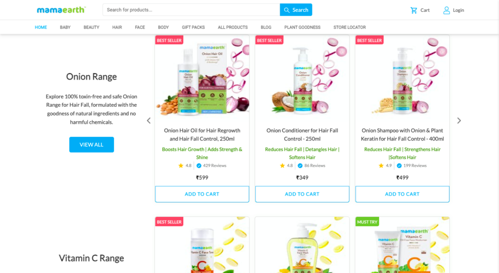
See how Mamaearth has used a combination of blue, green and white to show cleanliness, a sense of calm, and a connection to nature.
Orange
A very happy colour, orange also shows motivation to do better. It has a positive vibe and makes the buyer feel like they are talking t someone friendly.
Related read: How to sell products online: Your complete guide (2022)
Now that you know what the different colours could mean – here is a short guide to how you can apply them to your eCommerce website.
Be careful when choosing a colour for:
Banner images
This is the first thing that consumers see when they are on your online store. Ensure that the banner or hero image is consistent with your brand’s visual identity.
Choose colours that you want your customers to immediately associate with your brand.
Backgrounds
The colour of the background is going to determine how your product images look, the colour of the text on your website and the hero graphics.
Choose a background that is not too distracting and does not irritate your customer.
Call to Action (CTA) buttons
Even though different reports suggest different methods for the “best colour for CTAs”, the reality is that it is slightly more complicated.
The CTA button colour depends on the entire colour structure of your eCommerce website. For example, imagine you have chosen greens and yellows for your website. DO you think having a green CTA works?
It doesn’t, purely because of the “Isolation effect” principle. The consumer is drawn to the CTA because
- It is isolated from the rest of the content
- The CTA button is in sharp contrast to the rest of the colour scheme
Here is an example by Spotify –

With an Instamojo online premium store, you have access to over 30+ themes that can help you
- Create a positive first impression on your customer
- Be consistent with your brand identity
- Customize the themes according to the products you sell online
Customise your store theme according to your brand vision. Change colours for your heading texts, actions buttons, header background and more.
You can also customise fonts! Browse through the available font list on your dashboard and preview them before applying them to your online store theme. Read more about our premium themes here.
Take the first step towards a visually stunning online store! Upgrade to a premium store now.

