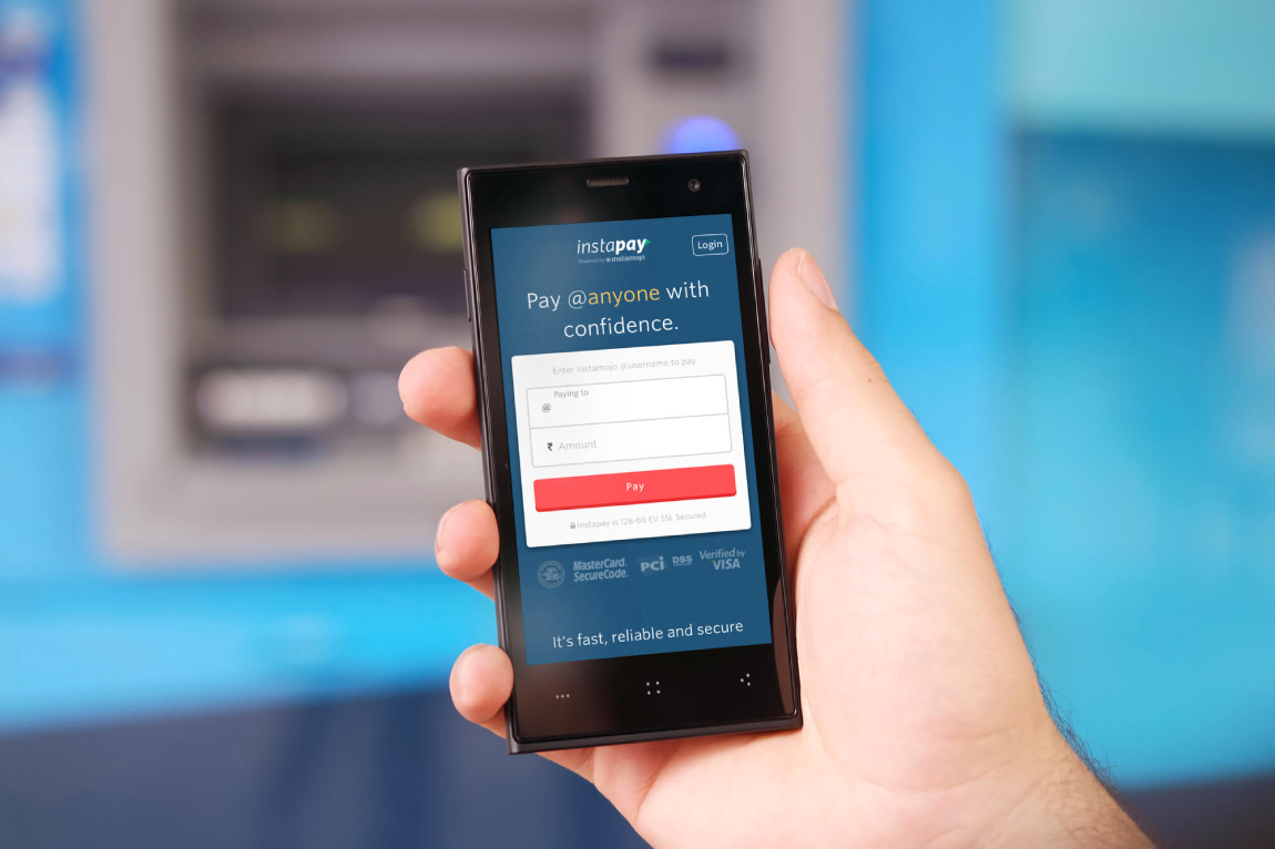
Releases are scary. Timing them well is very important and there goes a lot into the preparation before such an occasion. This week, we bring you the newest thing we built here at our cosy den – Instapay.
Instapay is a feature on Instamojo that takes the process of making online payments to a different paradigm—to an approach that we think is very easy, fast and secure—essentially how online payments should’ve been from the beginning.
With the goal of making payments more natural, more human and more personal, we put a lot of thought into how the process itself can be revised.
Our idea is—In an ideal world, we would want online payments to work as seamlessly as paying cash in hand.
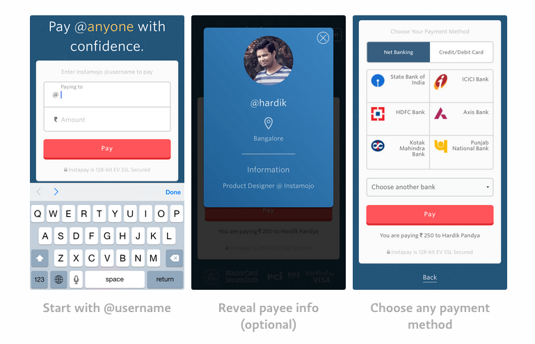
With Instapay, we reveal a new method of making payments. We eliminate the step of exchanging your banking pleasantries—i.e. your account number, IFSC code and such. All you do is share your unique Instamojo @username and anybody can directly pay you money with his preferred method (sounds so darn simple, right? That’s because it is simple!).
This is a lot easier than usual NEFT and IMPS transfer gateways banks provide. Having Instapay means you don’t have to log in to the bank gateways every single time and worry about connections timing out while you fiddle to find your login details.
No more exchanging bank-pleasantries like Account Number and IFSC code for paying or sending money. We handle that for you. Your @username becomes your and your business’s financial identity.
Design and Details
Always begin your design with a necessity (the reason for building something), then check the usefulness (testing if what you built is useful and is solving the problem) and then focus on beauty.
For Instapay, we started pretty much with a blank slate with a mobile-first approach in mind. This was because we were solving a problem for a different set of users – the buyers (instead of the regular Instamojo folk) or the customers of our customers (the merchants).
Hence, the visual language, written copy and product message – all had to take into account this shift. Simplicity and speed of making payments were key.
Colour palette
For picking colours for the palette, we experimented with a few different options. Our priority was to choose soothing, neutral and assuring colours. We decided to go with a shade of navy blue (#255578) for the vast background around the card. The hexagonal pattern represents a network of payments while maintaining distance from the action card in prominence. For the Pay button, we wanted a very inviting, friendly and distinct colour – a delicious shade of red made the final cut (#FF555A). The clean and spacey layout was chosen carefully to be that way. The fonts used are Whitney from Hoefler & Co. for their stability and ridiculously beautiful and curvy ‘@’ character (not joking!).
Interface
We started with the bare minimum that was required from the user as input, and we packaged it in a coherent card-shaped interface. The reasoning here was the key fact that we were targeting on-the-go payments when you’re out and about. We don’t want you to have to open up bulky pages and scripts to pay. Hence the interface is minimal and loads quickly on mobile browsers even on Edge (2G) networks (we tested this along the way).
The card-shaped layout holds its shape and structure well on the mobile screens and expands a little for the widescreen desktop monitors. Although on wide monitors, actionable region remains the same maintaining uniformity in payment experience and lightweight asset bundles.
Here, I have shown some of the further screens in the flow. As you can see, the card layout is where the action happens. You have a chance to go ‘Back’ in the flow as well.
So here’s how we ported the 3 stages of design to Instapay:
- Necessity: Every merchant’s ready-to-go payment solution with minimal setup time
- Usefulness: Facilitating payments via net-banking (support of nearly 30 banks) or credit/debit cards (Visa, MasterCard, Maestro)
- Beautification: Having an easy to use and clean interface that works across browsers and across devices for on-the-go payments
Online payment methods are the next UX playground.
And we want to be the ones who bring the best payment experience to you. This way, we also empower small businesses who are very close to our heart, to start accepting payments in a very easy and fast way that was never possible for them before.
Prototyping and testing
If this has to be put in just one statement, it would be –
Lo-fidelity (on paper) and hi-fidelity (near-final pixels) prototyping helps get clarity on the concept and design. Its advantages shouldn’t be overlooked.
Designing for web is such a pain with the number of browsers and screen-sizes that need to be taken into account (hat-tip BrowserStack). At Instamojo, we now prototype every new feature and product right down to fine-tuned animations and hi-fidelity flows. The screen and interfaces take life in Sketch and gradually turn into a more complete flow in Marvel or Pixate depending upon the complexity required.

Seeing disjoint screens of your app is very different from seeing a complete flow. Many times we realized the number of steps to make a payment was too long and some of them could be combined into a single meaningful form. The Instapay web-app went through 5 different iterations from its first version and we prototyped animations and movements through Pixate. Many intermediate designs broke in certain browsers and animations that didn’t perform properly at all on mobile devices.
This was frustrating at times but such exercise also helped us lean-up our app to a bare minimal high-efficiency payment experience. This also made the job of developing a lot less painful and much faster.
With the advent of rich and empowering tools that are coming in this newly found domain for designers and developers alike, I believe it’s easier than ever to see the semi-real deal before beginning development.
The Future
And for our Instapay users,
- We are working hard to reduce the number of payment steps you’ve to go through.
- Our team will eliminate long checkout queues to make payments (asynchronous payments).
- We are making money transfers easier and less cumbersome than NEFT and IMPS.
Register for Instamojo and start using Instapay right away. There are tons of cool short @usernames up for grab.
If Instapay made you fall in love with it instantly, you will surely love what we have in store for you in the next couple of months (totally not dropping hints!). Stay tuned to know about it as soon as we launch and reach out to me @hvpandya if you’ve any questions regarding Instapay.


